Pulp Staffers' 2016 Art Fair Picks
Have you guys ever noticed that Art Fair is HUGE? Or that it's unbearably hot (not just this year, but somehow every year)? It can make it pretty difficult to hit all of the thousands of booths that are set up to find the best of the best. This year, Pulp staffers decided to help by heading out on opening day and finding our favorites. These artists are all definitely worth checking out, whether you are looking to buy or looking to look.
Stan H. Baker
Stan H. Baker, ceramic artist from Ann Arbor, was set up on Main Street selling his map plates and wall globes. The wonderful details of the wall-mounted half moons caught my attention – each one depicts a different phase of the moon. What drew me in further was when I realized that he is masterfully using the raku firing technique for the purpose of depicting the dark portion of the moon. He is also able to get beautiful iridescent glaze effects. I’m a big fan of maps and his didn’t disappoint. -Anne
Jen Callahan, Coastal Colors
Jen Callahan is a Florida-based artist whose artwork looks like a paint-aisle explosion in the best way possible. Her artwork features beachy, seaside settings and underwater creatures, made all the more enchanting by her vibrant color palette that seems to include everything from tranquil blues and purples to luminous greens and pinks. If you've never seen a rainbow-coated jellyfish or a sea turtle painted like a stained-glass window, it's definitely time to upgrade your life. -Nicole
D & M Wooden Flowers
D & M is local, based out of Saline, and their brilliantly-colored wooden flowers are some of the most impressive wood carvings I have ever seen. Their basswood lilies, tulips, and daffodils are painted in sunny colors that render them bright, detailed, and so realistic that I almost can't remember why I bother to buy real flowers when I could be buying breathtaking wooden daises that my cats can't destroy and eat. -Nicole
ISMS - Holly Ulm
Minnesota-native Holly Ulm drew my eye through the natural colors of her incredibly delicate-looking butterfly jewelry and art prints. Her art is offbeat and whimsical, featuring things like a black and white cat with brightly-colored Monarch wings or a mermaid with a tail that changes smoothly into the wings of a moth. All of Ulm's art uses the wings of real butterflies who have completed their life cycles and died of natural causes at butterfly conservation farms. Ulm then uses what I can only imagine is a 100-bajillion-step process to preserve the wings in as close to their natural state as possible--and she does a beautiful job. Each piece of jewelry is gorgeous and every art print manages to incorporate the wings in a way that lets their natural beauty speak for itself. -Nicole
Katydids Kritters
Katydids Kritters is another local artist who makes art of the 3-dimensional variety. Her adorable hand-sewn wares are not only decorative, but functional! Owl-shaped doorstops, little critter sleep masks, and hot and cold therapy plushies that can be used on sore muscles and other pains. Because how could you possible still feel bad with an adorable stuffed penguin hanging out on your sore knee? You can't, that's how. -Nicole
Katie Musolff
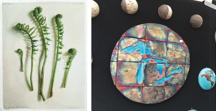
When looking through booths I might take a closer look at before going out (you've got to make a plan on these 95 degree days), Katie Musolff's work didn't make my list. Interesting photographs, but that's not really my thing. But this is because thumbnails don't do her work justice. Those plants and animals, all apparently photographed from above in museum cases or on kitchen tables, aren't photographs at all but exquisitely rendered gouache paintings. They are done with such skill that they appear at a distance to be the real thing, but this is not photorealism or trompe-l'oeil. Musolff has simply mastered her tools so well that her paintings communicate all the essence and form of her natural subjects. Mushrooms pop off the page and fiddlehead ferns are in their brightest April green. Musolff conveys the life of these items, freshly ripped out of the ground for their moment of immortality. As you look, you can almost smell them.
-Andrew
Michelina Risbeck
Michelina Risbeck is a University of Michigan student. She creates mixed media works using household paint and joint compound on Plexiglass that explore the interplay of texture and color. Often reminding me of landscapes or abstract renditions of microscopic biological processes--like the division of cells--or the chaos that was the beginning of the universe. One of the artists I was totally blown away by in the Street Art Fair's New Art, New Artists (NANA) booth, selected to participate in this one-on-one mentoring program and are exhibiting for the first time at the Art Fair.-Anne
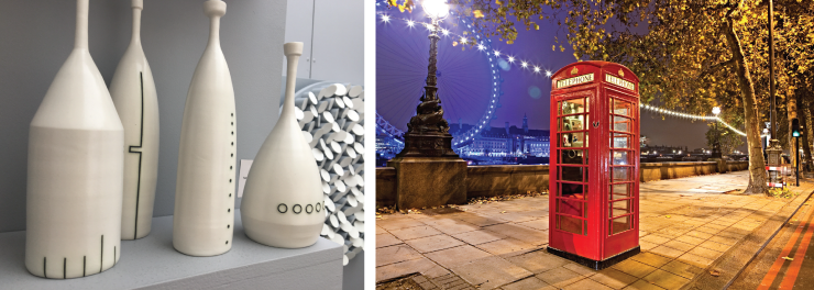
Chris Rom & Geoff Buddie
Ohio husband and wife team Chris Rom and Geoff Buddie are back for their ninth Ann Arbor Art Fair. Their work is a collaborative effort; they use porcelain, wood, fiber, and mixed media to create elegant minimalistic works. Repetition of shape creates visual interest and the hint of sequence. Their work ranges from familiar objects, such as bottles made of porcelain with a clear glaze and minimal black line decoration, to larger more abstract wall installations made up of repeating geometric 3D shapes. Intricate shadows add to the overall composition, which changes with the angle of light or the viewer’s angle of perspective. There is an order to their work that evokes a sense of calm. Though neither Chris nor Geoff would admit to an overtly mathematical background, they did mention that there is at least one engineer in their family. An earlier work of theirs is on permanent display at the Downtown Library (first floor near the new books). -Anne
Christine Schub
Christine Schub has been showing at the Street Art Fair for about 20 years now, and there's a reason why she is a staple. Her work never disappoints in its intricacy and liveliness. Strictly nonrepresentational, her paintings lead the viewer to imprint their own loves on them; I see city buses, building facades, aerial views of landscapes, and geological layers, all dancing around each other. She says that hearing what people see is one of the most enjoyable parts of being a painter and coming to the Fair. There are certainly echoes of Mondrian before he went full-on neoplasticist, but you won't find any rigidly straight lines here. These paintings almost appear ready to drip right off the canvas, and it's that life and presence that has made Schub's work worth checking out all of these years. -Andrew
Kyle Spears
I was drawn to the red phone box sitting like a Tardis at the center of Kyle Spears’ “London, England” color photograph. A string of white lights runs behind it and down the receding sidewalk, while further beyond lies the London Eye and the Houses of Parliament lit in bright blue. Other prints in Spears’s booth are similarly alive with color, light, and contrasting edges or textures, an effect enhanced through long exposure using a medium format film camera and a combination of traditional and digital printing techniques. A couple black and white photographs focus on what Spears calls “moments of beauty amid chaos”: In “Notions of Time, Paris, France,” an odd-shaped corner building and striped crosswalk precede a curved alley and a ghostly time-lapsed figure; in “Fragile, Tokyo, Japan,” a jumble of squares, rectangles, and lines define the back of a building complex while simultaneously framing a woman’s face on a billboard. Spears not only shows us the world we see, he shows us the world as we’d want to see it. -Amy
 Impermanence #713 by Nha Vuu.">
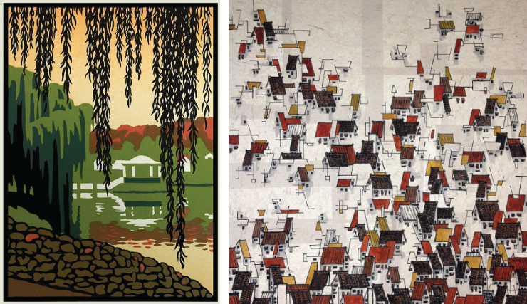
Nha Vuu
Nha Vuu had a few different things on offer, including some beautiful, large-scale renderings of flowers and other plants that evoke traditional Chinese paintings, but the things that drew me in were the rooftops. Vuu has a number of large works that depict the roofs of crowded residential areas, just lines of ink applied with a brush that hint at actual structures, occasionally with a splash of color, all on handmade paper. These remind one a bit of those same traditional Chinese paintings, but also of Cezanne's Provencal landscapes, Russian Constructivism, and Richard Thompson's Cul de Sac. In the smaller works, the rooftops dissolve into unrecognizable abstractions, easy to take as being not at all representational, simply a pleasing arrangement of lines and shapes. Each of the works shows a mastery of composition, whitespace, and the daringness to eschew all but a very limited palette, used in a very limited way. The alleys and backstreets between these houses are ones you'll want to explore up close. -Andrew
Christopher Wheeler
The best art is almost never the same piece at two feet away that it was at twenty. Christopher Wheeler's mixed media pieces fit this bill very nicely, changing as you approach, inviting you to come in closer, and then requiring that you back up again to take it all in. As you pass by the booth, his large pieces seem to just be paintings: flattened, geometric representations of trees and building facades. Lovely, but sterile in a midcentury modern sort of a way. But upon closer inspection, you find that those flattened shapes are not flat at all but made up of small pieces of paper, painted and then applied to make up a color area with subtle texture. Each of the birch limbs is a Matisse-like cutout, lightly painted in a way that, as you back up, makes you marvel that four cuts with scissors and one pass with a brush can give such a perfect illusion. It all combines to create works that draw you in to inspect, then pull back out to look at the whole again, then zoom in on another aspect. If you buy one, be sure to place it where people can look at it up close and where the light can show off those beautiful textural variations.
-Andrew
Jack White
Retired engineer Jack White’s photography is sharp and full of wonderful contrasts. Though he’s from Pinckney, MI, his Rocks and Roots series was shot in New England. Tree roots and granite form a symbiotic relationship as they become entangled over time. Jack has an eye for framing the perfect shot and capturing just the right moment when the light hits it just so. Most of his photographs are black and white, but if you look closely you’ll catch a hint of color (added by hand) in some. Another of the artists I was totally blown away by in the Street Art Fair's New Art, New Artists (NANA) booth-Anne
Laura Wilder
I'm a sucker for block printing so as I was exploring the S. University Fair I was drawn to Laura Wilder's booth immediately. The intensity of the colors, contrast, and the use of negative space are magnetic in block printing. Wilder's work pulls you in and a close inspection is required. I was drawn initially to her depictions of nature, seasons, ferns, and other flora. I particularly liked her block print entitled Hiawatha Lake because she uses the willow trees to softly frame the structure in the background. Once in her booth I was equally drawn to her whimsical and lovely serigraph, The Scottie, just one of her many dog breed pieces. Wilder's Seasons IV, a four-season woods/stream framed piece would make a dramatic and soothing addition to a room. The panoramic layout, the use of color and the intensity of the work evoke the movement and shadows in nature. My favorite pieces were traditional block prints. Wilder describes the process: usually created with wood or linoleum blocks; non-image area is cut away, leaving only the image surface raised above non-printing areas. The ink is usually applied with rollers; may be printed with a press, a baren, a rolling pin, or a wooden spoon. Wilder offered her work in lush wood frames as well as limited edition giclees, note cards, mini-prints, posters, and more. Wilder is from Rochester, NY, and some of her work is off landmarks and popular spots in that region. -Erin
Nick Wroblewski
Printmaker Nick Wroblewski’s woodblock prints are breathtaking. Obviously he is inspired by the Japanese woodblock tradition, but his subjects and colors are unmistakably North American. Beautiful forest scenes, wetlands, and birds are all masterfully recreated. He uses the reduction printing method where a multi-color print is created using only one block by cutting away more and more of the surface in-between each color printing. The block is ultimately destroyed as each new color is carved. He has an example of the carved blocks on display to illustrate the process. Definitely worth a look. -Anne
Pulp staffers declined to write about their real Art Fair Picks: water bottles, t-shirts, umbrellas, and shady trees.
The 2016 Ann Arbor Art Fair will continue through Sunday, July 24, 2016.
Preview: David Mitchell reading from his new novel Slade House

Author David Mitchell will be giving a reading from his newest novel Slade House this Saturday, November 7, in the sanctuary of the First United Methodist Church, followed by a conversation with author and UM faculty member Peter Ho Davies. Fans of speculative fiction may be familiar with Mitchell through his previous novels including The Bone Clocks, number9dream, and, most famously, Cloud Atlas. This event is sponsored by Literati and University of Michigan Helen Zell Writers' Program.
Slade House is an outgrowth of Mitchell's last novel, The Bone Clocks, set in the same universe. It started as a short story that Mitchell published on Twitter. This story, revised and added to, is now the first chapter of Slade House. It might be this that we have to thank for the fact that this novel is by far Mitchell's shortest and by all accounts his most accessible.
As with several of Mitchell's books, Slade House makes use of multiple narrators and crosses through time, each section set nine years later than the previous. Every 40 pages or so we get a new narrator and the degree to which we are pulled into the life of each protagonist is astounding. A fully imagined character with a complete backstory and well-drawn secondary characters emerges in the first dozen pages every time. Each of these stories has a definite ending before a new narrator takes over, so Mitchell doesn't fall into the trap of Italo Calvino's If on a winter's night a traveler of leaving the reader hanging before moving on, never to return (though perhaps this is only a trap for those of us who want those books-within-the-book to keep going). In Slade House, you understand very quickly where each of these stories is going, and the inevitable ending of each.
To some extent it begins to feel like a procedural, a backwards Law & Order where you know the culprit, you know the crime, you know the ending, and it is the main character/detective (one time a literal detective) and the situation that switches out. The result of this is that by the second story you start reading it like a mystery, looking for patterns and clues (was that jogger there the last time? what's the significance of the grandfather clock? why the portraits?).
Slade House is difficult to classify; at first it seems to be a ghost story. But it isn't quite horror, as it isn't horrifying. And though it starts off with the trappings of a classic ghost story, by the end of the first section, it becomes something else, and by 2/3 through the novel, it is apparent that what you are reading is no less than high fantasy. There is a haunted house, sure, and there are ghosts, yes. But the ghosts aren't the thing to be scared of, and what does the haunting is far less malicious than the house being haunted. The final section of the novel and its ending did not appeal to me, but that's a matter of taste, not a failing on Mitchell's part. A high fantasy ending felt a bit like a bait-and-switch to me, but that's because I want my ghost stories to be ghost stories. Those more in sync with epic battles between forces of light and darkness will be more sympathetic to it.
The biggest failing of this novel may actually be how well thought-out its world is; Mitchell has so much to explain about what is happening that at times it starts to feel like the latest Bond villain laying out his whole plan. But this exposition is necessary as Mitchell needs you to understand what is happening for it all to come together. And it never gets bad enough that all of the magic is stripped out (no midi-chorians here), just enough that you get pulled out of the world by it. But the fact that new worlds are created again and again in the span of 240 pages is in itself an achievement that makes Slade House well worth the read.
Andrew MacLaren is a Production Librarian at the Ann Arbor District Library and the only parlors he haunts are pizza parlors.
David Mitchell's reading takes place this Saturday, November 7, at 6 pm (doors open at 5:15 pm) in the sanctuary of the First United Methodist Church. A copy of Slade House is included in the $30 admission price (this price also includes entry for either one or two people). Tickets are available online.
ARTS AROUND ANN ARBOR
WHAT WOOD YOU LIKE TO DO THIS WEEKEND?


