Review: Intermitten – Technology and Arts Conference
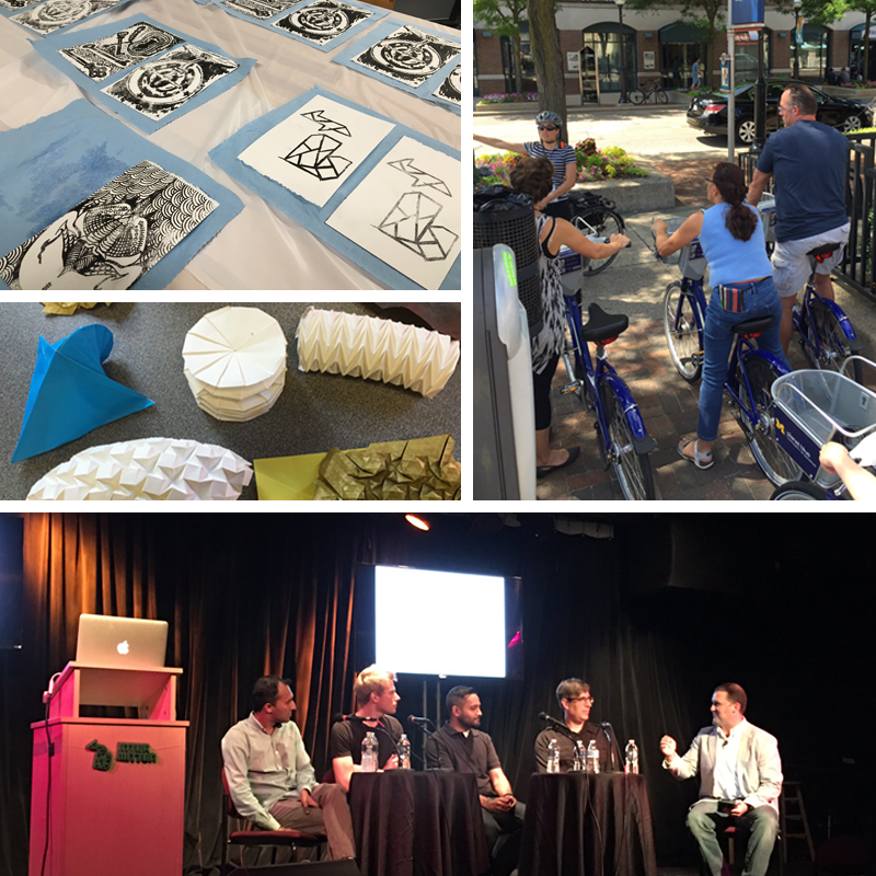
Creativity and passion hit the Ark stage last Friday and Saturday and impressed the value of hard work and following your dreams upon the completely engaged and enthusiastic attendees of the first ever (and soon to be annual – please!) Intermitten Technology and Arts Conference. The primary goal, as stated in their press release, was “to explore ways in which creativity has an ever-expanding role in our increasingly-connected world.” And they totally hit it out of the ballpark with a diverse and impressive mix of artists, musicians, filmmakers, startup founders, and techies of all sorts who came together to inspire us all to change the world with creativity, perseverance, and a little bit of business knowledge shared from those who went down that path before us.
So, what is Intermitten and where did it come from? Founded by a handful of Ann Arbor startup employees in the fall of 2015, it’s two days packed full of talks and social/networking mixers (at Rush, the Pretzel Bell, and the Hands-On Museum). There are also a few specially curated events and carefully selected stops to take in even more of what makes Ann Arbor such a great place to be – a guided bike tour by Nancy Shore of AAATA, a lithography workshop at AADL with local printmaker Jess Richard, a Pop-In at the Ann Arbor Art Center , and drinks at the Ann Arbor Distilling Company, to name a few.
And WOW. Just, WOW. I was blown away and left with my mind reeling with ideas and plans for where to take the creative energy that was absorbed by being in the presence of so many generous and wonderful folks. What I liked best about this conference was the small-town Midwestern friendliness buttered upon the toast of a technology and arts conference. I can’t wait to see what collaborations come from the connections made at Intermitten and – even more so – what they’ll come up with for next year. I don’t know how they’ll top this one!
It’s impossible to pack all of the excitement and enthusiasm of Intermitten into a few words, but here are a few highlights from two AADL staffers who attended:
Amanda’s picks:
Sean Hoskins is a choreographer and performer and is the dance technology coordinator and production assistant at the University of Michigan. His passionate talk focused on having the willingness to incorporate technology into your art form. He states that creativity happens through work and that it’s important to “notice what you notice and trust that what you notice matters.”
Kendall Burke is a customer happiness specialist at Acuity Scheduling and offered an energetic and hilarious talk comparing finding the perfect job to finding the perfect mate, and yes, she referenced Tinder and Beyoncé. Burke talked about first loves in the job world, as well as toxic relationships with jobs, and eventually… one true love – that job you were truly made for. She encouraged that one should feel comfortable, confident, and empowered when walking into one’s job, and if that isn’t happening something needs to change. Her talk also included a slide with a video of baby goats in pajamas, which delighted the audience.
Sarah Hatter is the founder and CEO of CoSupport, which offers customer support coaching, among other things. In her words, “we teach companies how to kick ass and survive.” Her inspiring talk went through her version of ten steps to running your own business. She quoted Walt Disney when saying “I think it’s important to have a good hard failure when you’re young.” In short, she encourages emerging entrepreneurs to get out there and try and fail and try again. Learn in freefall.
Jon Sulkow of ICON Interactive, a digital marketing agency, spoke about some of the projects he’s worked on. One of the Intermitten Conference evening events included the POP-IN at the Ann Arbor Art Center, where Sulkow and electronic musician Shigeto created a live audio-visual experience involving virtual reality. In his talk he discussed how the project came to be and how they created the visual images viewed through the HTC Vive headset.
Jesse Vollmar and Qasar Younis spoke together in the afternoon. Vollmar is the CEO and co-founder of FarmLogs, which helps growers use technology to create a better future for their farms. Younis is the COO of the Silicon Valley incubator Y Combinator. Keeping in line with similar themes from the conference, they spoke about using your passion to start a company, but also discussed how passion isn’t enough, and that it’s necessary but not sufficient. Know what drives you and stick with it, but also be honest about it.
Anne’s picks:
Joe Malcoun and Guy Suter: Who wants a little bit of the Google Campus lifestyle in their work? Joe Malcoun, CEO of Nutshell, and Guy Suter, developer behind the email management app Notion, presented In Cahoots: Getting Creative With Tech Space, a talk on the upcoming workspace Cahoots, scheduled to open in 2017. They’re planning to create a space where passionate and focused creatives can work along side motivated members of the tech community in a sustainable environment. It will be more than a tech campus co-op, though—Cahoots also promises an event space to serve as a destination for anyone in Ann Arbor with an interest in art and technology.
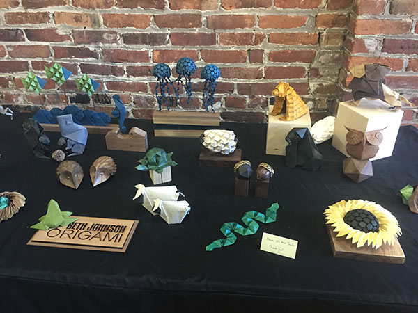
Beth Johnson: If you ask a person to tell you a story, most of the time they’ll stammer as they try to think something up. But if you ask them to tell you a story about their worst birthday party, they’ll leap right in and start. It seems counterintuitive, but limitations breed creativity, which was one of the themes of origami artist Beth Johnson's talk. In Creativity Through Constraints, Johnson revealed how working with an arbitrary set of parameters and presenting one’s self with a problem actually unlocks creativity. Your engagement within those parameters and the solving of the problem can reveal the art. Johnson also demonstrated how folding can be applied to engineering problems as well. From folding proteins to foldable structures to solar arrays, the art of folding can be used to solve a variety of technical challenges!
Shigeto: Part of the life cycle in making things is getting a reaction from a user or audience. So it’s natural that you might begin to anticipate their response before you’re finished with the making part. Zach Saginaw's (Ghostly International’s Shigeto) talk, The Pursuit of Passion, was a refreshing splash of water in the face, reminding us that one should make the work first to make ourselves happy. The monetary and service aspects of the artifact can be worked out later! He also delivered another useful reminder, especially to those of us just starting on our creative journeys: one should work with what one has, rather than waiting until one has acquired the right tools. The pursuit of passion must begin with the pursuit!
Leslie Raymond and Jason Jay Stevens: When we think of “Artist with a Capital ‘A’,” many of us imagine dour, serious, or inscrutable characters who defy us to understand or appreciate them. But sometimes artists can be mischievous experimenters who treat their work like structured play. Leslie Raymond and Jason Jay Stevens are definitely in the latter camp. Their talk. “Set the Moving Image Free,” was an exploration of the wide array of “collaborations, experimentations, curations & presentations” they create, such as animated GIF collages or mixing audio and video live in their Black Box Theater presentations at the Duderstadt. Their Peep Holes pieces present the viewer with an out-of-body experience by inviting your mind to exist in another space by virtue of the eye-sized portal. The most inspiring aspect of their talk, however, was the notion of collaboration between artists and between artists and their audience. They explored principles of UX design, which asks the artist to empathize with the recipient of the art and asks the recipient to act as a collaborator in the full expression of the piece. This was exactly what needed to be said at an event emphasizing crossover and collaboration between the arts and tech scenes!
Anne Drozd is a Production Librarian at the Ann Arbor District Library. Amanda Schott is a Library Technician at the Ann Arbor District Library and definitely notices what she notices.
Intermitten was Friday, August 5 and Saturday, August 6, 2016. Be sure to check their website for future plans.
Review: The Final Ann Arbor Art Center Pop-In of the Summer
The Ann Arbor Art Center held their third and final Pop-In event of the summer last Friday, in collaboration with the Intermitten conference. The conference, which focused on creativity and innovation, took place in Ann Arbor on August 5-6. Curated by Intermitten, this Pop-In event, like the two before it, featured unique art focusing on creating an immersive experience for attendees.
Immediately upon entering the Art Center, the loose, electronic, trippy music of Shigeto enveloped the senses. A large screen showed sporadic movement around an orange-tinted landscape that coordinated with the music. It took a moment to realize that individuals participating in the ICON Interactive virtual reality experience beyond Shigeto’s DJ table were controlling the movement on the screen, and the music itself to a certain extent. Wearing virtual reality goggles and holding a remote-like device that allowed users to “move,” ICON Interactive was definitely a favorite part of the show for many. One young boy became progressively more amazed as he went deeper into the VR world, and volunteers had to stand against the walls near him to protect the art as he jumped around waving the remote wildly.
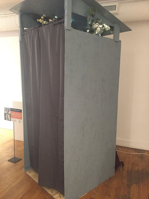
After ascending the stairs to the Art Center's second floor, visitors were greeted by a large, gray phone booth-like structure with a curtain hanging down from the front side. This installation was Switch Flip, created by Anna Nuxoll and Chris Czub. Described as a “hacked phone booth,” the setting of the piece is the year 2056. As explained by Nuxoll, she and Czub imagined an astronaut who has travelled beyond the solar system, only to realize that someone has been there before. The astronaut finds a series of communications booths, and Switch Flip is meant to be one of them. Inside the booth, along with lights and eerie plants, a telephone sits on a stand with a note inviting users to “dial Earth.” Apparently, upon picking up the phone one would hear an old-fashioned dial up tone, and then could push different buttons to hear up to 30 sound samples, but the Raspberry Pi computer running the exhibit broke just 45 minutes before the show began. The concept and the booth itself were cool, but the piece was marred by the technology failure.
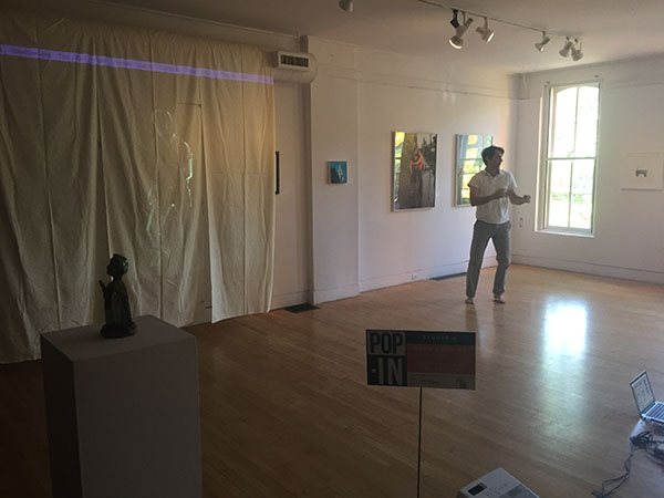
Also on the second floor was the live screen dance piece iSelf, created and performed by Sean Hoskins. The gorgeous space that the Art Center had for this performance added to it immensely; the white walls and hardwood floors offered no distractions from Hoskins, who was framed by the sunlight filtering in through the trees outside the floor-to-ceiling windows on the north side of the building. A white linen cloth cut into three strips hung from the Art Center ceiling and after the lights were dimmed Hoskins stepped forward from a corner of the room saying, “I’d like to start off by introducing myself: me, myself, iSelf,” and commenced his dance. His image was also projected into the strips of cloth using Isadora software. Later in the performance, the images on the screen doubled and viewers saw the differences in the visual field from one frame to the next, and eventually saw Hoskins’ dance on a three second and seven second delay. The entire effect was of multiple dancers that had all choreographed a complicated performance together although it was really just Hoskins, essentially dancing with himself.
The third floor of the Art Center featured very different displays. In one studio, A2ESK8’s electronic skateboard display took up the entire room. Sadly for some, attendees weren’t allowed to actually try out the electronic boards, but there was a video, directed by Rik Cordero, playing continuously showing people riding them. There were five electronic skateboards on display, and they apparently have a top speed of 35-38 miles per hour and a range of 10 miles.
The room across the hall from A2ESK8 featured an origami exhibition by Beth Johnson, along with a demonstration and hands-on opportunity to make one’s own origami creation. Johnson’s origami is not of the usual type. She creates amazing flora and fauna out of earth-toned paper with exquisite detail. This Pulp writer was particularly intrigued by the origami sunflower and the jellyfish that Johnson managed to construct out of paper. Her designs have a distinctly geometric look, giving them all a modern feel that traditional origami lacks. The room was filled with eager amateur origami artists spread out across several tables constructing designs with the aid of books and Johnson herself.
I was delighted by the contrast of Johnson’s origami with the art exhibition by Jeremy Wheeler, which shared the same studio space. Wheeler’s posters often advertise local events past and present—some more obscure than others—and feature big words, bright colors, and eye-catching images. My personal favorite piece was the Boss Hog 2016 tour poster, depicting various people running away from a giant crustacean-like beetle. “17 years in the making! Now they emerge!” cries the poster. “Nothing can prepare you for… BOSS HOG.”
Overall, there cannot be any doubt that the Art Center’s Pop-In series this summer was a success. The diversity of the artists featured, the welcoming and accessible atmosphere that greeted attendees, and the Art Center’s ability to offer it all for free made this event and the two prior a truly special addition to summer in Ann Arbor.
Elizabeth Pearce is a library technician at the Ann Arbor District Library. She has no desire to travel 38 miles per hour on a skateboard but commends those who do.
Review: "Real American" at the Ann Arbor Art Center

The Ann Arbor Art Center’s latest 117 Gallery offering asks a tantalizing, if not also impossible question to satisfactorily answer: Who—and what—is a real American?
Indeed, more precisely: What physical, cultural, theological, and/or social features does a real American have? Do these perimeters have any boundaries that pertain to being a “real” American? And what are the political consequences—if there are any such consequences—attached to this definition?
After all, the presumption is (and it’s certainly been repeated enough during this present election cycle) that there is such a thing as a “real” American. And it’s a seemingly strong potion upon which to mount a political campaign.
But is there such a thing as a real American? This display of superlative art intends to find out—for better or worse.
As juror and Ann Arbor-based photojournalist Peter Baker tells us of his rationale for the exhibit, “Real American” seeks to “explore the generational, ethnographic, cultural, and anthropological ideals of what the word ‘American’ means. From fresh apple pie to Budweiser, the Star Spangled Banner to Party in the USA, what is the modern American experience?
“Are we entering the sci-fi World of Tomorrow, longing for the Norman Rockwell past, or painting ourselves into an Idiocracy? If our culture is our biggest export, what kind of image are we presenting to the world?
“This exhibition,” concludes Baker “seeks artworks that span the spectrum from whimsical to austere, nostalgic to provocative. Artworks may consist of images from popular and visual culture, contain everyday objects assembled in unexpected ways, or incorporate stars and stripes.”
Correctly said—and perhaps the best thing about Baker’s selections in this show is the extraordinary range of what a real American can be. After all, even if the common understanding is also obviously a caricature, Americans cannot by definition or description be said to be analogous to what a Frenchman or Irishman or Nigerian supposedly looks like—or supposedly is. The beauty of the term is that a real American can look like all stereotypes.
Local, regional, and national artists selected for inclusion by Baker are Jim Aho, Mark Bleshenski, Tina Blondell, CJ Breil, Sarah Buddendeck, Seder Burns, Barbara Melnik Carson, Vanessa Compton, Errol Daniels, Keith Downie, Dan Farnum, Kathie Foley-Meyer, Heather Freeman, Jonathan Frey, David Gardner, Sarah Hahn, Amber Harrison, Christian Helser, Timothy Householder, Melissa Lynn, Astrid Muller-Karger, Dietmar Krumrey, C.B. Murphy, John Posa, Shawn Quinlan, Jim Rehlin, Jaye Schlesinger, Geoffrey Stein, Marilynn Thomas, Seth Trent, Tamara Wasserman, Chad Yenney, and Micah Zavacky.
Baker’s Best of Show selection in the exhibition is Pittsburgh, PA resident Shawn Quinlan’s quilt and fiber “The New American Heritage.” Second Place is Tulsa, OK photographer Dan Farnum’s archival inkjet color photograph “Monster Energy, Tulsa.” Third Place is Ann Arbor John Posa’s untitled acrylic on canvas mixed-media deer hide and scrap metal Donald Trump portrait. And Honorable Mentions have been handed to Minneapolis, MN’s Tina Blondell for her oil on canvas “Antimony as Nubia” and Denver, CO’s Melissa Lynn for her “Mitchelen BigMan—Crow Indian/Iraq Veteran” chromogenic color photograph print.
As stated above—and is the case with most group exhibits—there’s no particular rhyme nor reason to the artwork in “Real American” outside of taking general aim at the topic. And interestingly enough, this speaks of both the pluralism of our society as it does these artists’ decidedly independent frame of mind. The exhibit proves it’s a good American place to be.
For example, Shawn Quinlan’s Best of Show quilt and fiber “The New American Heritage” is an emphatic satirical take on what is real about being a “Real American” as the quilt takes scatological aim at the U.S.A. through its lampooning of our society’s strengths and weaknesses. Uncle Sam is depicted as a red, white, and blue clown with straw hat atop and arms propped with disembodied six-shooters at waist-height standing in front of a cloud of newspaper smoke and fire. Add an exceptionally buff George Washington as well as a vaguely surreal exquisite corpse Abraham Lincoln charbroiling a steak and Quinlan’s “The New American Heritage” is a rather pungent view of what it means to be a “Real American.”
“The New American Heritage” is one of many artworks in this exhibit that have an overt political or social bent—this is the kind of display that brings out the best of this kind of parody. Yet license of free thought is only one aspect of what it means to be an American. On the other hand, Baker’s Second Place archival inkjet “Monster Energy, Tulsa” by Dan Farnum touches far more subtly and thoughtfully at class and economics in its artless depiction of an everyday group of archetypical American youths standing casually in front of suburban strip mall.
But so much for politics: The exhibit is also exceedingly lyrical, and my favorite work on display is Allen Park, MI Seder Burns’ magnificent archival inkjet “RV Camped for the Night on BLM Land in Colorado” color photograph that describes an “unexpected, quirky, and complex” view of what it means to be a real American.
This lone camper vehicle, taking advantage of federal regulation that allows for extended free camping (albeit in a band of states running vertically from Montana to New Mexico; horizontally west to the Pacific Ocean) is shown after dusk set against a magnificent American countryside with stars and stripes strategically draped across the front windshield.
Burns’ photograph clearly partakes of what it means to be a “real” American as there’s a free-spiritedness that’s been part of our national wanderlust reaching back for centuries from the days of Native American habitation up and down North America to varied European-based explorations through the Manifest Destiny that’s subsequently championed continental expansion. His “RV Camped for the Night” merely gives this notion a well-deserved 21st century spin.
Shawn Quinlan, Dan Farnum, and Seder Burns ultimately span the range of what Baker heartily illustrates in this exhibit. Yet there are, of course, many more views. What’s implicitly inferred in each work in this display is the belief that what it means to be a “real” American is really no more than a psychological state of mind—and everything else proceeds from there.
John Carlos Cantú has written on our community's visual arts in a number of different periodicals.
“Real American” will continue through August 13 at the Ann Arbor Art Center 117 Gallery, 117 W. Liberty St. Exhibit hours are 10 am to 7 pm, Monday-Friday; 10 am to 6 pm, Saturday; and noon to 5 pm, Sunday. For information, call (734) 994-8004.
Ann Arbor Art Fair 2016: Photo Gallery
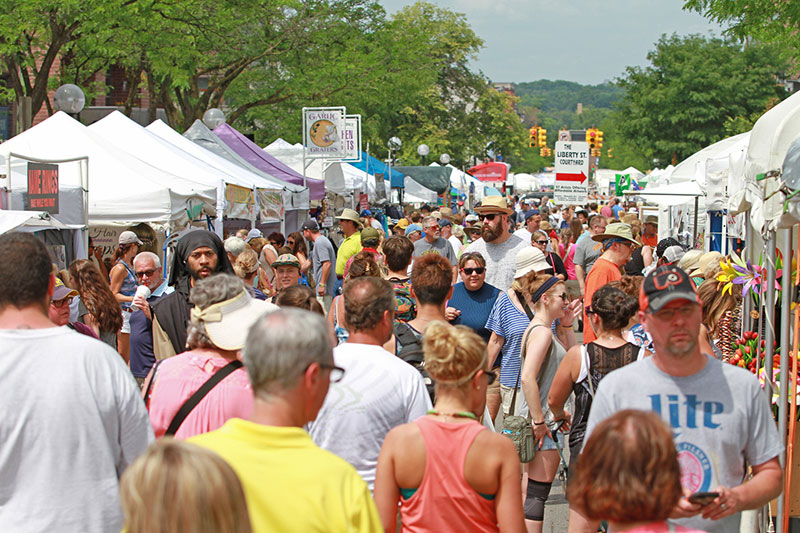
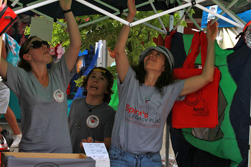
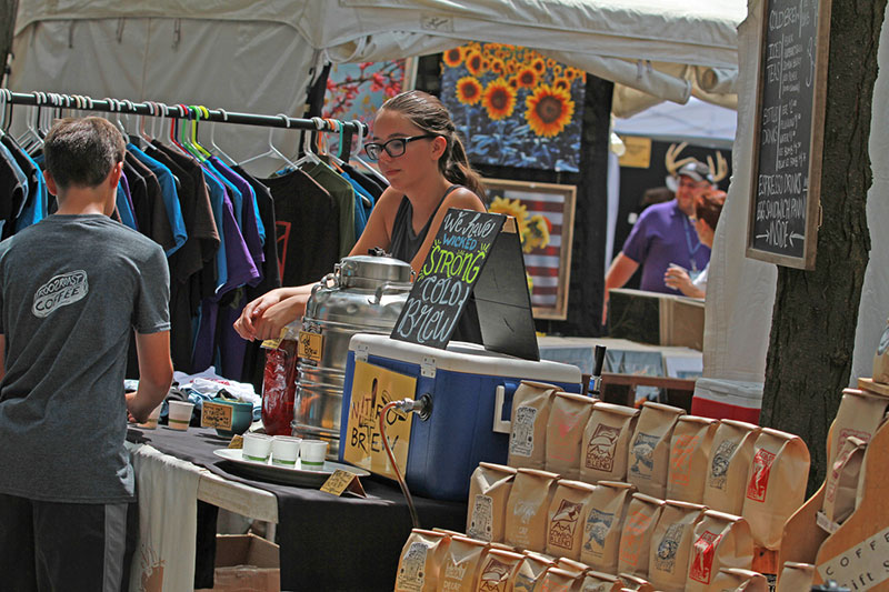
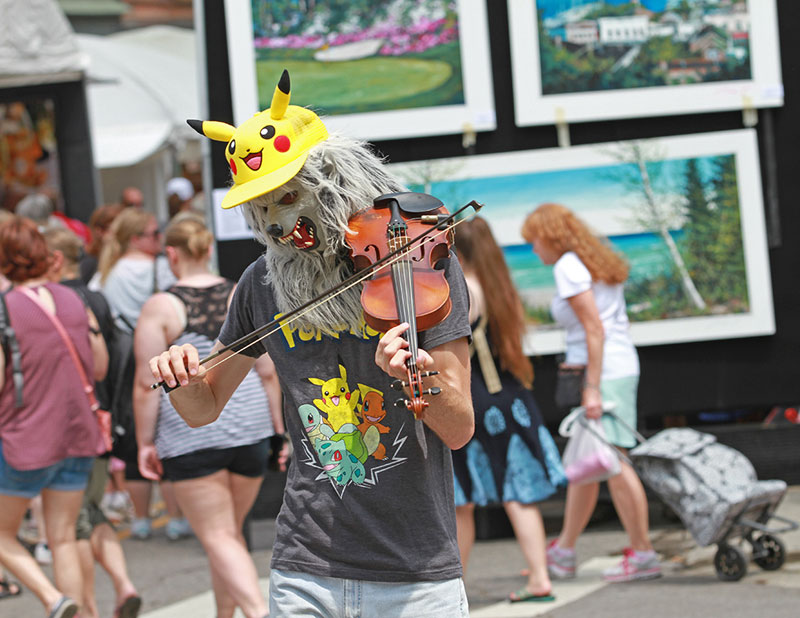
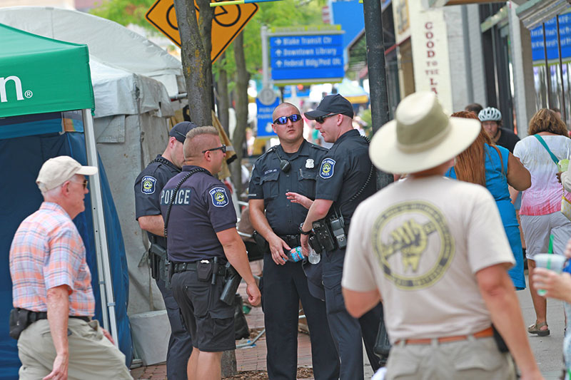
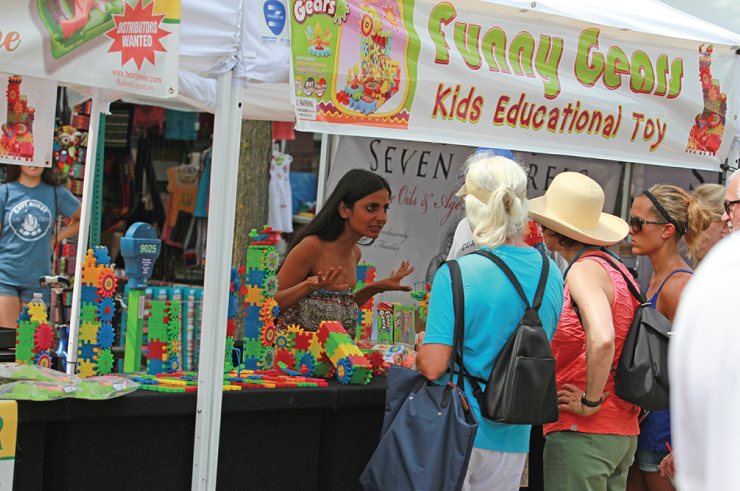
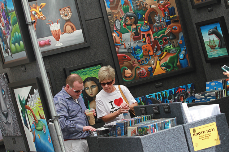
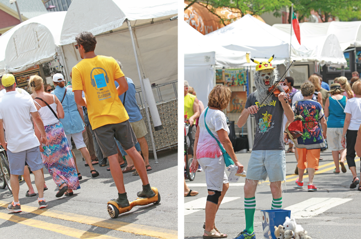
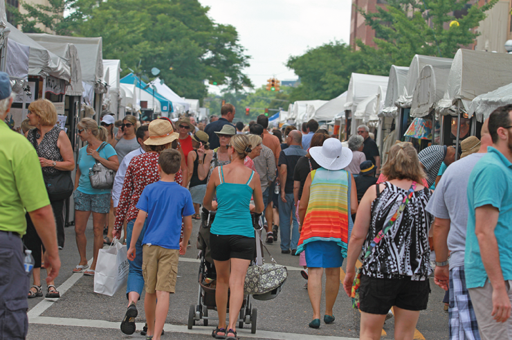
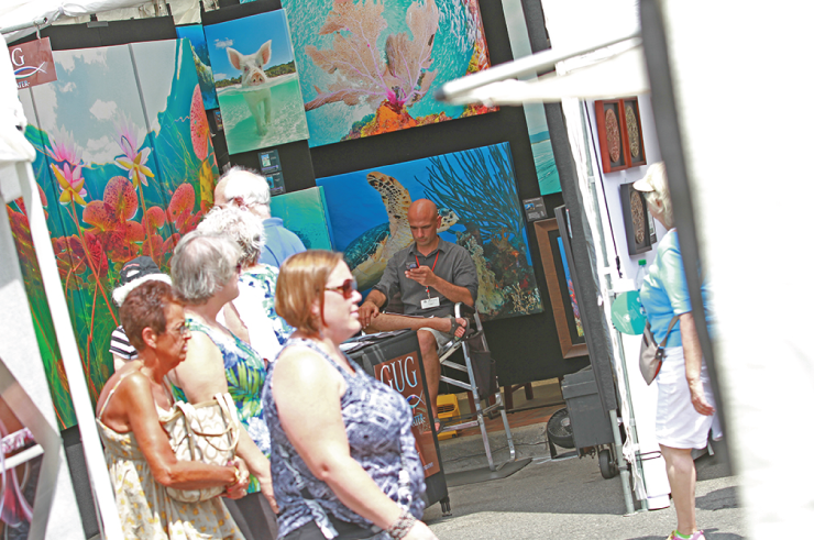
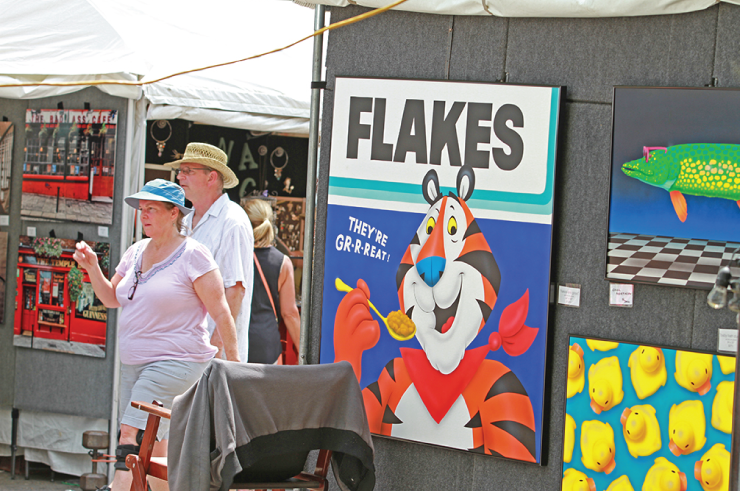
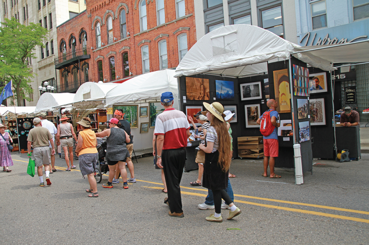
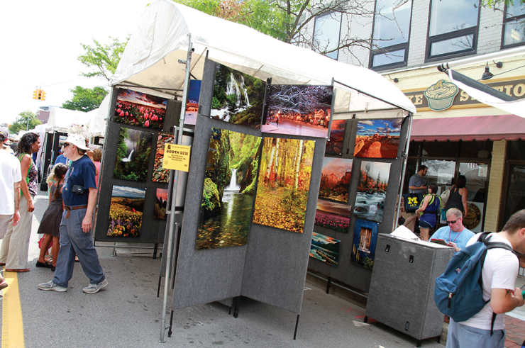
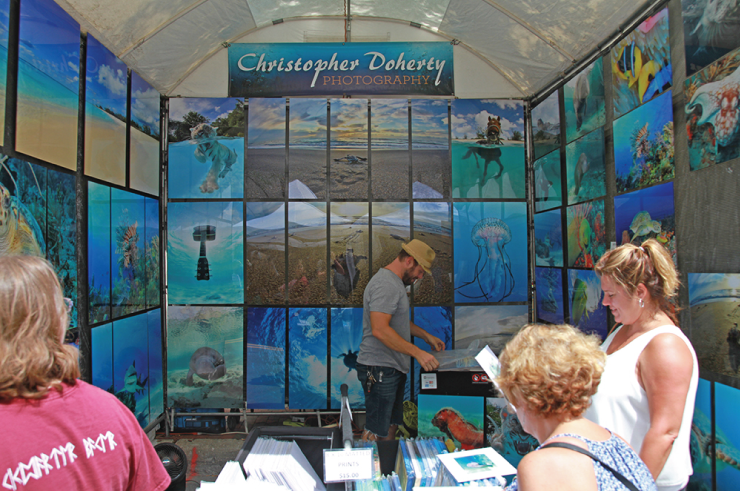
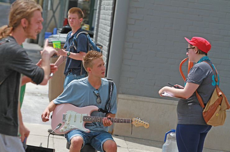
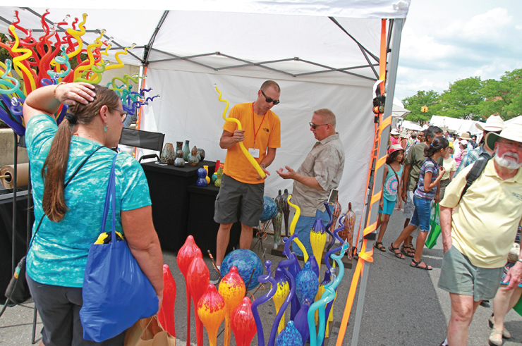
The Ann Arbor Art Fair is an annual event. The 2016 Art Fair was Thursday, July 21 through Sunday, July 24, 2016. Check their website for information and announcements for next year's festivities.
Art Fair Sketchbook: Karin Wagner Coron
Ever wondered what the Ann Arbor Art Fair is like from the artists' perspective? We asked Karin Wagner Coron who was set up in booth A307 on North University Ave. to give us her view – in sketches:
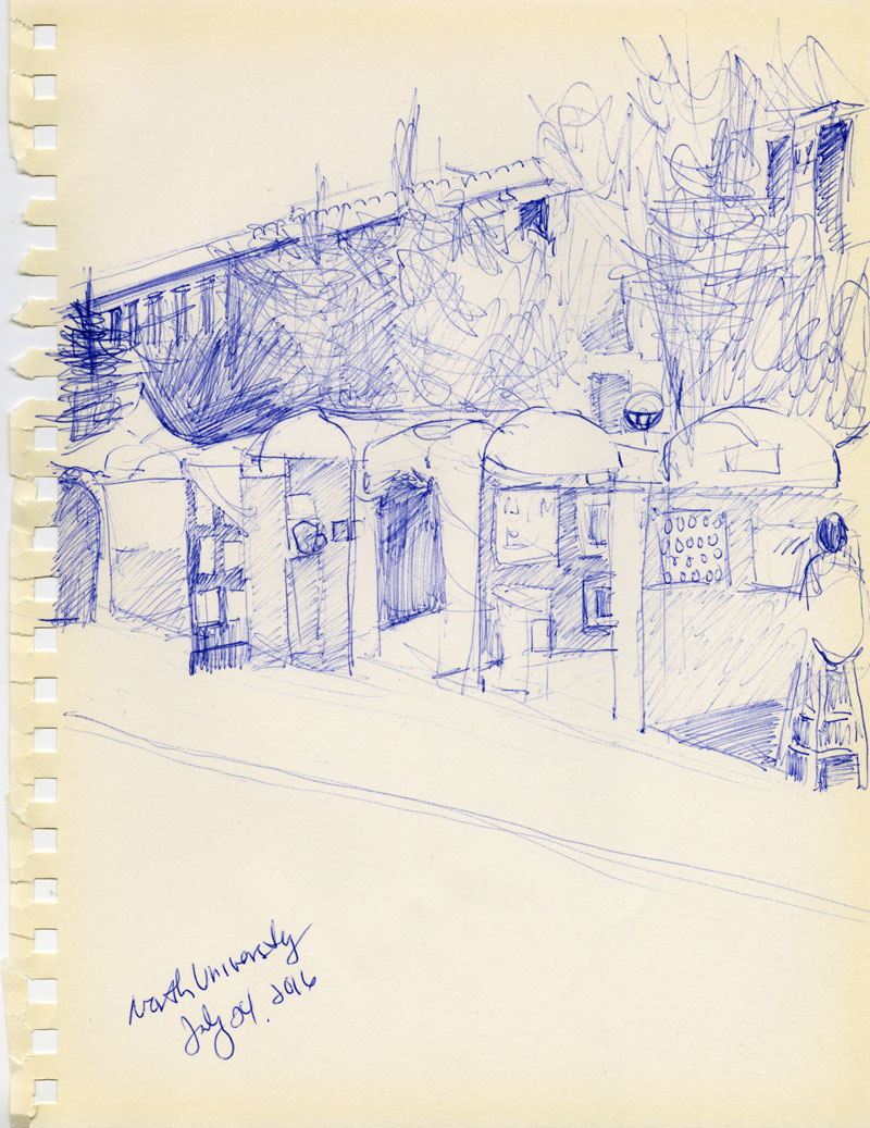
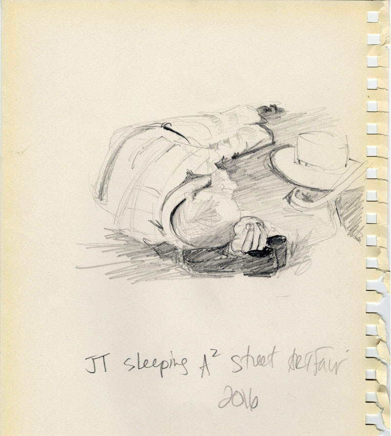
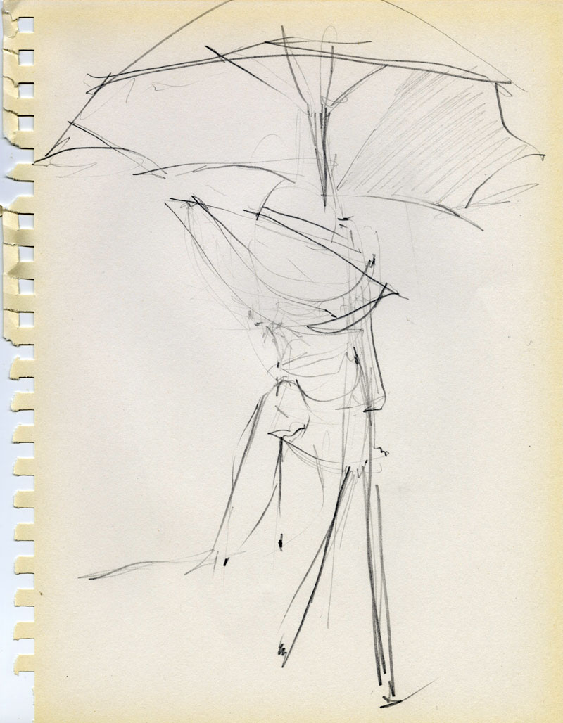
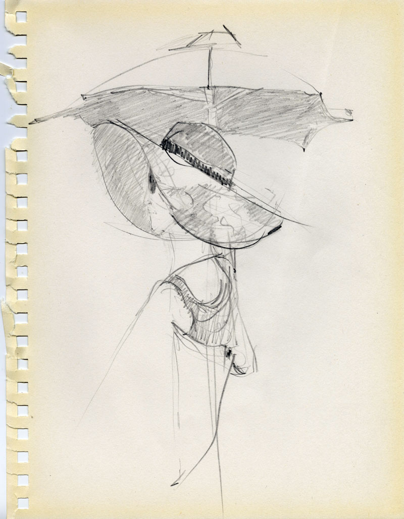
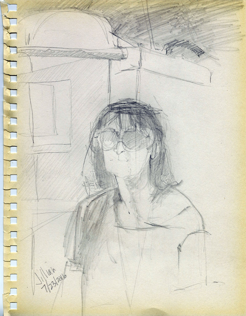
Karin Wagner Coron is a native of Michigan and a Great Lakes Region artist. She earned a Bachelor of Fine Arts degree from Eastern Michigan University in drawing and painting, which launched her career as an artist and arts business owner. She is a member of the WSG Gallery, and owner/operator of Format Framing and Gallery. You'll find some of Karin's works in AADL's circulating art print collection.
Pulp Staffers' 2016 Art Fair Picks
Have you guys ever noticed that Art Fair is HUGE? Or that it's unbearably hot (not just this year, but somehow every year)? It can make it pretty difficult to hit all of the thousands of booths that are set up to find the best of the best. This year, Pulp staffers decided to help by heading out on opening day and finding our favorites. These artists are all definitely worth checking out, whether you are looking to buy or looking to look.
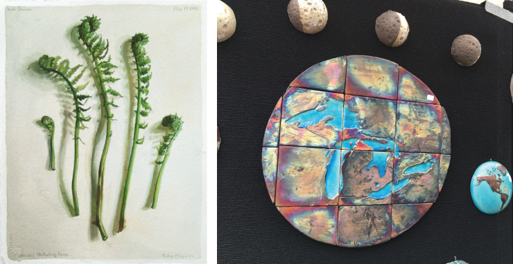
Stan H. Baker
Stan H. Baker, ceramic artist from Ann Arbor, was set up on Main Street selling his map plates and wall globes. The wonderful details of the wall-mounted half moons caught my attention – each one depicts a different phase of the moon. What drew me in further was when I realized that he is masterfully using the raku firing technique for the purpose of depicting the dark portion of the moon. He is also able to get beautiful iridescent glaze effects. I’m a big fan of maps and his didn’t disappoint. -Anne
Jen Callahan, Coastal Colors
Jen Callahan is a Florida-based artist whose artwork looks like a paint-aisle explosion in the best way possible. Her artwork features beachy, seaside settings and underwater creatures, made all the more enchanting by her vibrant color palette that seems to include everything from tranquil blues and purples to luminous greens and pinks. If you've never seen a rainbow-coated jellyfish or a sea turtle painted like a stained-glass window, it's definitely time to upgrade your life. -Nicole
D & M Wooden Flowers
D & M is local, based out of Saline, and their brilliantly-colored wooden flowers are some of the most impressive wood carvings I have ever seen. Their basswood lilies, tulips, and daffodils are painted in sunny colors that render them bright, detailed, and so realistic that I almost can't remember why I bother to buy real flowers when I could be buying breathtaking wooden daises that my cats can't destroy and eat. -Nicole
ISMS - Holly Ulm
Minnesota-native Holly Ulm drew my eye through the natural colors of her incredibly delicate-looking butterfly jewelry and art prints. Her art is offbeat and whimsical, featuring things like a black and white cat with brightly-colored Monarch wings or a mermaid with a tail that changes smoothly into the wings of a moth. All of Ulm's art uses the wings of real butterflies who have completed their life cycles and died of natural causes at butterfly conservation farms. Ulm then uses what I can only imagine is a 100-bajillion-step process to preserve the wings in as close to their natural state as possible--and she does a beautiful job. Each piece of jewelry is gorgeous and every art print manages to incorporate the wings in a way that lets their natural beauty speak for itself. -Nicole
Katydids Kritters
Katydids Kritters is another local artist who makes art of the 3-dimensional variety. Her adorable hand-sewn wares are not only decorative, but functional! Owl-shaped doorstops, little critter sleep masks, and hot and cold therapy plushies that can be used on sore muscles and other pains. Because how could you possible still feel bad with an adorable stuffed penguin hanging out on your sore knee? You can't, that's how. -Nicole
Katie Musolff
When looking through booths I might take a closer look at before going out (you've got to make a plan on these 95 degree days), Katie Musolff's work didn't make my list. Interesting photographs, but that's not really my thing. But this is because thumbnails don't do her work justice. Those plants and animals, all apparently photographed from above in museum cases or on kitchen tables, aren't photographs at all but exquisitely rendered gouache paintings. They are done with such skill that they appear at a distance to be the real thing, but this is not photorealism or trompe-l'oeil. Musolff has simply mastered her tools so well that her paintings communicate all the essence and form of her natural subjects. Mushrooms pop off the page and fiddlehead ferns are in their brightest April green. Musolff conveys the life of these items, freshly ripped out of the ground for their moment of immortality. As you look, you can almost smell them.
-Andrew
Michelina Risbeck
Michelina Risbeck is a University of Michigan student. She creates mixed media works using household paint and joint compound on Plexiglass that explore the interplay of texture and color. Often reminding me of landscapes or abstract renditions of microscopic biological processes--like the division of cells--or the chaos that was the beginning of the universe. One of the artists I was totally blown away by in the Street Art Fair's New Art, New Artists (NANA) booth, selected to participate in this one-on-one mentoring program and are exhibiting for the first time at the Art Fair.-Anne
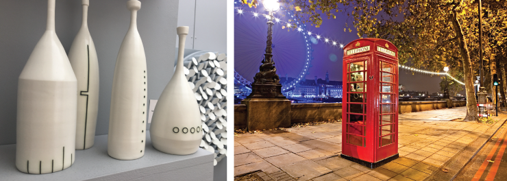
Chris Rom & Geoff Buddie
Ohio husband and wife team Chris Rom and Geoff Buddie are back for their ninth Ann Arbor Art Fair. Their work is a collaborative effort; they use porcelain, wood, fiber, and mixed media to create elegant minimalistic works. Repetition of shape creates visual interest and the hint of sequence. Their work ranges from familiar objects, such as bottles made of porcelain with a clear glaze and minimal black line decoration, to larger more abstract wall installations made up of repeating geometric 3D shapes. Intricate shadows add to the overall composition, which changes with the angle of light or the viewer’s angle of perspective. There is an order to their work that evokes a sense of calm. Though neither Chris nor Geoff would admit to an overtly mathematical background, they did mention that there is at least one engineer in their family. An earlier work of theirs is on permanent display at the Downtown Library (first floor near the new books). -Anne
Christine Schub
Christine Schub has been showing at the Street Art Fair for about 20 years now, and there's a reason why she is a staple. Her work never disappoints in its intricacy and liveliness. Strictly nonrepresentational, her paintings lead the viewer to imprint their own loves on them; I see city buses, building facades, aerial views of landscapes, and geological layers, all dancing around each other. She says that hearing what people see is one of the most enjoyable parts of being a painter and coming to the Fair. There are certainly echoes of Mondrian before he went full-on neoplasticist, but you won't find any rigidly straight lines here. These paintings almost appear ready to drip right off the canvas, and it's that life and presence that has made Schub's work worth checking out all of these years. -Andrew
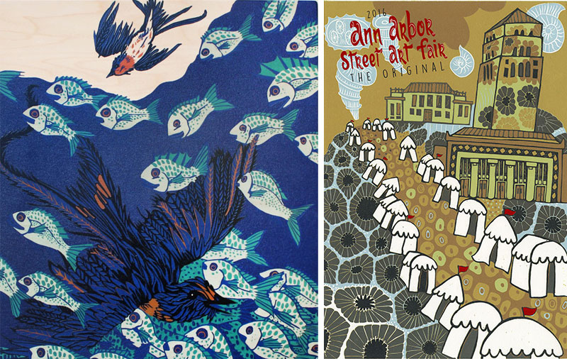
Kyle Spears
I was drawn to the red phone box sitting like a Tardis at the center of Kyle Spears’ “London, England” color photograph. A string of white lights runs behind it and down the receding sidewalk, while further beyond lies the London Eye and the Houses of Parliament lit in bright blue. Other prints in Spears’s booth are similarly alive with color, light, and contrasting edges or textures, an effect enhanced through long exposure using a medium format film camera and a combination of traditional and digital printing techniques. A couple black and white photographs focus on what Spears calls “moments of beauty amid chaos”: In “Notions of Time, Paris, France,” an odd-shaped corner building and striped crosswalk precede a curved alley and a ghostly time-lapsed figure; in “Fragile, Tokyo, Japan,” a jumble of squares, rectangles, and lines define the back of a building complex while simultaneously framing a woman’s face on a billboard. Spears not only shows us the world we see, he shows us the world as we’d want to see it. -Amy
 Impermanence #713 by Nha Vuu.">
Nha Vuu
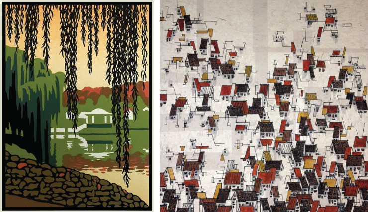
Nha Vuu had a few different things on offer, including some beautiful, large-scale renderings of flowers and other plants that evoke traditional Chinese paintings, but the things that drew me in were the rooftops. Vuu has a number of large works that depict the roofs of crowded residential areas, just lines of ink applied with a brush that hint at actual structures, occasionally with a splash of color, all on handmade paper. These remind one a bit of those same traditional Chinese paintings, but also of Cezanne's Provencal landscapes, Russian Constructivism, and Richard Thompson's Cul de Sac. In the smaller works, the rooftops dissolve into unrecognizable abstractions, easy to take as being not at all representational, simply a pleasing arrangement of lines and shapes. Each of the works shows a mastery of composition, whitespace, and the daringness to eschew all but a very limited palette, used in a very limited way. The alleys and backstreets between these houses are ones you'll want to explore up close. -Andrew
Christopher Wheeler
The best art is almost never the same piece at two feet away that it was at twenty. Christopher Wheeler's mixed media pieces fit this bill very nicely, changing as you approach, inviting you to come in closer, and then requiring that you back up again to take it all in. As you pass by the booth, his large pieces seem to just be paintings: flattened, geometric representations of trees and building facades. Lovely, but sterile in a midcentury modern sort of a way. But upon closer inspection, you find that those flattened shapes are not flat at all but made up of small pieces of paper, painted and then applied to make up a color area with subtle texture. Each of the birch limbs is a Matisse-like cutout, lightly painted in a way that, as you back up, makes you marvel that four cuts with scissors and one pass with a brush can give such a perfect illusion. It all combines to create works that draw you in to inspect, then pull back out to look at the whole again, then zoom in on another aspect. If you buy one, be sure to place it where people can look at it up close and where the light can show off those beautiful textural variations.
-Andrew
Jack White
Retired engineer Jack White’s photography is sharp and full of wonderful contrasts. Though he’s from Pinckney, MI, his Rocks and Roots series was shot in New England. Tree roots and granite form a symbiotic relationship as they become entangled over time. Jack has an eye for framing the perfect shot and capturing just the right moment when the light hits it just so. Most of his photographs are black and white, but if you look closely you’ll catch a hint of color (added by hand) in some. Another of the artists I was totally blown away by in the Street Art Fair's New Art, New Artists (NANA) booth-Anne
Laura Wilder
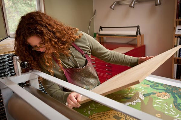
I'm a sucker for block printing so as I was exploring the S. University Fair I was drawn to Laura Wilder's booth immediately. The intensity of the colors, contrast, and the use of negative space are magnetic in block printing. Wilder's work pulls you in and a close inspection is required. I was drawn initially to her depictions of nature, seasons, ferns, and other flora. I particularly liked her block print entitled Hiawatha Lake because she uses the willow trees to softly frame the structure in the background. Once in her booth I was equally drawn to her whimsical and lovely serigraph, The Scottie, just one of her many dog breed pieces. Wilder's Seasons IV, a four-season woods/stream framed piece would make a dramatic and soothing addition to a room. The panoramic layout, the use of color and the intensity of the work evoke the movement and shadows in nature. My favorite pieces were traditional block prints. Wilder describes the process: usually created with wood or linoleum blocks; non-image area is cut away, leaving only the image surface raised above non-printing areas. The ink is usually applied with rollers; may be printed with a press, a baren, a rolling pin, or a wooden spoon. Wilder offered her work in lush wood frames as well as limited edition giclees, note cards, mini-prints, posters, and more. Wilder is from Rochester, NY, and some of her work is off landmarks and popular spots in that region. -Erin
Nick Wroblewski
Printmaker Nick Wroblewski’s woodblock prints are breathtaking. Obviously he is inspired by the Japanese woodblock tradition, but his subjects and colors are unmistakably North American. Beautiful forest scenes, wetlands, and birds are all masterfully recreated. He uses the reduction printing method where a multi-color print is created using only one block by cutting away more and more of the surface in-between each color printing. The block is ultimately destroyed as each new color is carved. He has an example of the carved blocks on display to illustrate the process. Definitely worth a look. -Anne
Pulp staffers declined to write about their real Art Fair Picks: water bottles, t-shirts, umbrellas, and shady trees.
The 2016 Ann Arbor Art Fair will continue through Sunday, July 24, 2016.
Preview: Jenny Pope & the Ann Arbor Art Fair
Summer in Ann Arbor often serves as a reminder of Michigan’s natural beauty. Flowers are in full bloom, animals run through our yards, and (even for the heat-phobic) the sunshine is a welcome relief from the dreary winter behind us. For some, like artist Jenny Pope, this draw to nature is year round. Jenny lives in Ithaca, NY and works full-time on her craft while traveling around the country to sell and display her work. Luckily, she will be setting up shop as this year’s featured artist at the Ann Arbor Street Art Fair, one of the four fairs which will be taking over downtown Ann Arbor from July 21st to the 24th.
Primarily a woodcut artist, Jenny is drawn to capturing a variety of flora and fauna from commonplace cardinals to lesser known (but highly invasive) species like lionfish. She reads about, discusses and watches nature endlessly, bringing her acute observational skills and fantastical imagination with her each time she starts a piece. Her unique vision really comes through in all of her work – especially with Jenny’s magical palette of color. After speaking with Jenny, it was clear to me she constantly meditates on her craft while noting the intricacies of the world around her. She brings these observations into her studio, and the results of such a well-lived artist’s life are clear in the quality of her work.
Q: Your range of products is truly impressive. From woodcuts to ceramics, it seems like you have your hand in everything. What was the first medium you worked in, and do you have a favorite medium?
A: I have been making woodcuts for over 10 years and selling them full time for the past 8. Ceramics are a new medium to me, I have been playing with clay for 2 years. I started working with clay just before getting pregnant and it was super helpful to have a second medium. I got so big that I couldn't reach over the etching press to print, so clay was the only medium I could work with. These days I probably spend 80% of my time making woodcuts and 20% of my time working with clay.
Q: The imprints and designs you use recall a very organic and natural element. Beyond the depictions of wildlife and flora, your art seeks to teach the viewer about the environment. For instance, one of my favorite pieces, "Swallows Overwintering Underwater," is part of a series addressing myths of bird migration. What inspired this series and others like it? What role do you view art as having in being a pathway to learning?
A: I enjoy working in series. I read a lot about nature and animals which is where many of my ideas come from. Only recently I have started making a few pieces about my personal history with nature. "Seven Species" is a large woodpecker woodcut about all the species I have seen in my yard and "Resident Cardinals" is about cardinals that don't migrate in the wintertime. In the background of the cardinal piece, I carved my house and studio and barn. My grandmother was also an artist and she mainly focused on birds. I make bird pieces a lot, and every time I do I think of her. I hope that my work inspires people to think of their own backyards and the wide world beyond.
Q: Out of curiosity, where do you create your artwork? My guess would be outdoors or with easy access to it. Or, do you work from memory or sketches that you've done at an earlier time?
A: I make my artwork at home. I have a print studio inside and a building that I fondly call the "clay shack" outside. I do a lot of carving out there. In the summertime, I open the windows all the way up, turn the fan on, and open both doors. It's like being outside. A few days ago, I was carving and a baby deer ran by about 2 feet away from my legs. It was playing with its twin. I use photos for reference all the time and have a sketchbook that is full of writing as well as images that I look back on when I am thinking about my next piece.
Q: Your pieces often feature non-native species or plant-life. Does travel or exploration of other regions play a role in the research for your art?
A: People often ask me if I have been to the places that I make art about. I do love to travel and have been to a lot of places, the most exotic was Australia and I feel so lucky to have spent time in that country. I love islands and island life so I try to visit islands whenever possible. But, I have made art about many places I have never set foot in. I have a series about islands that I like to call, "Isolation produces oddballs," which features Myanmar and Indonesia, both places I have never been to.
Q: Is this your first year at Art Fair, and if not, what was your experience like last year? Why have you chosen to participate in Art Fair? Do you feel events like these are important for building a community around art?
A: I have been selling my art professionally at festivals for the past 8 years. The reason I do it is because I don't know a better way to make a living as an artist. I sell a lot of work online these days, but it is mostly to people who have seen it before at a show. I have a pretty hefty list of people who have signed my guestbook at festivals and I send out emails once a month when I finish a new piece. I think the festival environment is really helpful for artists being able to meet potential customers directly and build relationships with them. I think this will be my 4th year at Ann Arbor. My parents live about 40 minutes away so it is also kind of a family trip. I have friends from high school and college in the area so I love coming back. It's nice to see familiar faces. I always do at least one new show a year so often it is a sea of unfamiliar faces.
Q: How do you prepare for a big event like Art Fair? Are you featuring the work from your website mostly or will you be introducing a new series?
A: My woodcuts take a long time to make. I have been working on 2 pieces for 3 months and just finished one but am still working on the other. They all are editioned, but very limited. So, I will be showing the woodcuts that are on my website. All of my clay work is one of a kind. There may be some of the pieces from my website but I also have been stocking up and not posting my new work so that I have enough for the show. My frames are new this year. I have been displaying my pieces without glass. I have them professionally mounted and then they are varnished like an oil painting. I am working with a fabulous woodworker who is making beautiful hardwood frames (walnut and curly maple.) You won't be able to go to a frame shop and get anything like it so I hope to sell a bunch at the show.
Juliana Roth is a writer currently living in Ann Arbor whose poetry, essays, and fiction have appeared in The Establishment, Irish Pages, Bear River Review, DIN Magazine, and other publications.
Jenny Pope will be set up in the Ingalls Mall section in booth number A258 at this year's Ann Arbor Art Fair from Thursday, July 21 to Sunday, July 24, 2016. Jenny’s work can be viewed on her website or you can be follow her online on Instagram and Facebook.
Review: Book + Paper Arts at WSG

Barbara Brown’s WSG Book + Paper Arts finds her latest book art exhibit—with a few paper arts thrown—nestled, as usual, at the intriguing intersection of ubiquity and uniqueness.
On one hand, like Brown’s prior WSG book-oriented displays starting with 2006’s Beyond Words, this edition of Book + Paper Arts calls into question the nature and function of “the book” while deconstructing by illustration what books look like.
What Brown’s exhibit ultimately shows us is that any commonplace assumption is at best questionable—and often simply irrelevant. As she says in her gallery statement, the emphasis of this occasional theme has evolved: “In previous show statements, I have put forth the assertion that the term ‘artist’s book’ often triggers much discussion, even bickering and irresolution amongst book artists, and the point has sometimes been made that at the very instant one uses that term, one must then be ready to define the definition!”
A commonplace definition would be that a “book” is a number of sheets of blank or ruled paper bound together for communicating expression. But this description is obviously a bit too loose to clarify what a book can be because the communication of expression can be as much abstractly symbolic as it is literature—hence, art.
So perhaps a more precise definition would be that a “book” is a handwritten or printed work of narrative fiction or nonfiction usually arranged on sheets of paper, parchment, or some other material fastened or bound together by surface covers. Yet this definition is obviously too tight—hence also, art.
It’s really this paradoxical slackness and restrictiveness that Book + Paper Arts seeks to imaginatively address. As Brown adds in her statement, “There will probably never be a determination that everyone agrees on, but I like ‘book inspired art’ (or BSO—book shaped object), and for me, that is a good beginning.”
“Book” art requires uniqueness, for even the most ardent conceptual use of the term denotes an object whose stance apart from the norm is the result of declaring itself aesthetic—with or without proper surface.
This makes WSG organizer Barbara Brown (as much ringleader here as she is curator) an artful instigator falling on the side of creativity as opposed to the omnipresent presence of the “book” itself. Working from the base definition (as indeed only a few of the artworks on display at the WSG actually even resemble books), Brown’s want (as well as the impulse of the artists in this exhibit) is to take this commonplace idea and twist, fold, manipulate, and mangle it until the concept virtually says (and ultimately is) what the artist wants it to say—or be.
This is indeed a sweet surrender. Because what the artists do in Book +Paper Arts is ultimately quite creative—certainly endlessly fascinating—even if the concept of book gets left behind in some equations. And so much better for what hangs and sits in the WSG Gallery.
Regional artists participating in the exhibit are Ruth Bardenstein, Ian McLellan Davis, Meghan Forbes, Alvey Jones, Norma Penchansky-Glasser, Ted Ramsay, Susan Skarsgard, Jack O. Summers, and Howard White. As local gallery browsers well know, this is an exceedingly distinguished (as well as insightful) clutch of talent. Calling out four artworks will reflect various stands—and strands—of these artists' intent.
For example, University of Michigan Art Professor Emeritus Ted Ramsay initially seems the furthest afield from book art in the exhibit—working in paper art rather than book art. In particular, his cast handmade rag paper, wood, enamel Memorial to Thylacines and Our Slaughtered Michigan Wolves seems definitely farthest afield—that is, farthest afield until the implication of his work is taken into account.
Linking the fate of this extinct South Pacific carnivorous marsupial to Michigan’s wolf population, Ramsey is stretching the use of paper art to bookend these creatures’ fortunes. Using his career-long strategy of creating vivid oversized three-dimensional tableau coupled with a whimsical canine reference, Ramsey’s work requires a bit of familiarity to plume his intent. Afterwards, and given the decided bent of his humor, Ramsay comes to book with a readymade arsenal of creativity that’s part aesthetic and part polemic. His Memorial to Thylacines and Our Slaughtered Michigan Wolves fits the bill.
General Motors Design Archive and Special Collections manager Susan Skarsgard has long made the alphabet her chosen topic and her contribution to this show devoted to book and paper art is a return of her iconic Alphabet Pop Up, a handsome wall-mounted copper metallic paper sculpture that we last saw in WSG’s Beyond Words 2008 edition as well as 2009 in Washtenaw Community College’s At the Junction: Calligraphic Design exhibit. It’s good to see this masterwork again.
A tidy three inches wide by six foot in height, Alphabet Pop Up’s near-abstract rendering of the ABCs is both compact and nifty. Keying on the common Latin grapheme and rendering each letter in a handsome blockish type, while also paying attention to descending scale, Skarsgard’s Alphabet Pop Up is a welcome reminder that sculpture, too, can be conceptually dependable as well as commendable—you can, as it were, make book on it.
![Mapaloopsa by Jack O. Summers [mixed-media].](/files/images/pulp/map_assemblages_jack_summers-2016.png)
Detroiter Jack O. Summer’s Mapaloosa is an imaginative reordering of the world’s geography through a series of colorful plates. As he says of this book art, “This clam shell of mixed up countries was created to illustrate how our world is changing and how we are impacting each other and losing some of identity as our planet becomes more crowded and disturbed.”
Fair enough. But the irony of Summer’s aesthetic is that even as these juxtapositions of differing architectural, national, and geographic boundaries are visually jarring slivers and chunks of familiar locales willy-nilly thrust upon each other, his mash-up of geopolitical boundaries and geographic landscapes in Mapaloosa also have an artful logic that meshes the unusual arrangements together.

Finally, it would be unfair to conclude without a tip of the artistic hat to Brown and her video collaborator Howard White. Their 15”x15”x20” Midsummer theater book certainly fits the definition of book art if anything does. It’s a miniature rectangular bookish movie theater with short feature film squeezed together as one—and an intriguing nature-based documentary, at that.
What Midsummer best illustrates is Brown’s unyielding commitment to book art—however it’s defined—through her reworking this object in multiple medias to expand and enlarge the definition until the concept encompasses the entire range of neo-Dada assemblage.
And that’s ultimately a hefty handful of art.
John Carlos Cantú has written extensively on our community's visual arts in a number of different periodicals.
Book + Paper Arts will run through July 30, 2016. The WSG Gallery is located at 306 S. Main Street: Tuesday-Wednesday, noon–6 p.m.; Thursday, noon-9 p.m.; Friday-Saturday, noon-10 p.m.; and Sunday, 1–5 p.m. For information, call 734-761-2287.
Arts Writers! UMS Seeking Candidates for a New Fellowship

The University Musical Society (UMS) is seeking applicants for their Wallace Blogging Fellowships. This recently-announced opportunity aims to promote cultural events taking place throughout southeast Michigan, and includes a stipend and special access to UMS events and guests.
So, know anyone in the area who is over 21 and loves the arts? Send the application their way! The deadline to apply is July 15, so get those writing samples ready!
Review: Ann Arbor Art Center's Pop-In

All three floors of the Ann Arbor Art Center pulsed with energy Friday night for this summer's inaugural Pop-In event. While the center's programming is generally eclectic on the whole, the free Pop-In series presents a particularly diverse assortment of art and entertainment in a single night, suitable for all ages but particularly aimed at young adults. This Friday's event, curated by Charlie Reischl, was billed as a "digital takeover" of the art center with a variety of offerings related to electronic arts. While some attractions adhered to that theme more than others, the evening was nonetheless consistently stimulating and entertaining in unexpected ways.
Upon entering the art center, DJ Scout set the mood on the first floor with some laid-back electronic grooves. Ascending to the second floor, attendees were welcomed by members of Kickshaw Theatre, who were recruiting "test subjects" for a short theater piece entitled Technology, In the Flesh. The 15-minute play repeated numerous times throughout the night, as Dr. Tina Burglorgler (Alysia Kolascz) and her assistant Quatthew (Aral Gribble) led audiences through a series of comical "experiments" exploring the differences between our reactions to analog and digital stimuli. In the most entertaining bit, Burglorgler showed the audience several slapstick YouTube videos and then replicated them on Quatthew in some cannily executed bits of stage violence. The differences in audience reaction were striking, as attendees remained mostly straight-faced during the videos but laughed or gasped openly as Burglorgler slammed Quatthew's head into a table and whacked him in the crotch with a baseball bat. The show oversold its point a bit–real-life experiences are consistently more stimulating than digital ones. But it was an amusing, creative second effort from the extremely promising new Kickshaw company, which produced the extraordinary The Electric Baby earlier this year.
Moving up to the third floor, attendees had a wide variety of attractions to explore. Attendees could have a hands-on experience with new technology by experimenting with a sampling of instruments from AADL's music tools collection or with a Wacom digital drawing tablet (under the able guidance of cartoonist Jerzy Drozd). Wandering into an adjacent darkened room, visitors could also take in a variety of unique musical performances, like the improv duo and art project Efflux. Efflux percussionist Jon Taylor and keyboardist Simon Alexander-Adam riffed wildly on their respective instruments while a custom-built program responded to their music in real time with abstract digital images projected on several small cube-shaped screens. Between the duo's inventive improvisation and the hypnotic digital imagery, Efflux presented a surprisingly spellbinding experience.
The highlight of the evening, however, was a concluding musical performance by members of the unconventional international rap performance collective known as the Black Opera. Ann Arbor rapper Jamall Bufford and Detroit rapper Magestik Legend kicked things off with what they described as an "opening set" for the Black Opera, energetically encouraging audience participation throughout. The two departed the stage but then returned, clad in oversized masks, to perform as the Black Opera themselves. The duo blasted through an impassioned set of songs with topics ranging from police violence to overuse of social media to the Flint water crisis. Bufford and Legend changed costumes for each song, ranging from dashikis to ski masks, with striking music videos projected behind them. At the conclusion of their performance, the duo announced that they and their entire audience were now part of the Black Opera. While the audience seemed equally divided between those who were previously aware of the Black Opera and those who were initially puzzled by what they were seeing, by the show's end Bufford and Legend had thoroughly accomplished their goal: drawing the crowd into a kind of critical, but positive, musical social movement.
Pop-In will continue this summer with events on July 22 and August 5. The July event will feature an inversion of this past Friday's theme, with an emphasis on analog music, tools, and art. The August installment will split the difference, focusing on the intersection of technology and creativity in a partnership with the new conference Intermitten. If Friday's Pop-In is any indication, attendees of the two coming events are in for an eye-opening, thought-provoking, and thoroughly entertaining experience.
Patrick Dunn is an Ann Arbor-based freelance writer whose work appears regularly in Pulp, the Detroit News, the Ann Arbor Observer, and other local publications. He would prefer that you neither slam his head into a table nor whack him in the crotch with a baseball bat, even if it would be funnier than watching a YouTube video.
Pop-In will continue this summer with events on July 22 and August 5.
ARTS AROUND ANN ARBOR
DEFINITELY NOT HOMOGENIZED


