
Outer Devotion: “Protecting Wisdom: Tibetan Book Covers” at UMMA
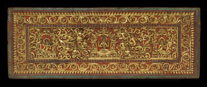
First times are always special. But a first-ever of something is especially special. Such is the case with the University of Michigan Museum of Art’s exhibit Protecting Wisdom: Tibetan Book Covers From the Maclean Collection.
Mounted in the UMMA’s Irving Stenn Jr. Family Gallery, this display not only presents us with an incomparable iconographic delight, it’s also the first time this art form's been exhibited in the United States -- and one of the first times these artworks have been seen by the public. So, yes, Protecting Wisdom really is special.
As the guest curator, Dr. Kathryn Selig Brown (U-M Ph.D. in Tibetan History of Art), tells us in her introduction:
It's Showtime: Japanese Prints of Kabuki Theater from the Collection of the University of Michigan Museum of Art

There are only a handful of art exhibits of such sophisticated complexity that they can absorb the viewer’s attention for an indefinite amount of time. Japanese Prints of Kabuki Theater from the Collection of the University of Michigan Museum of Art is one of those treasures.
This display, mounted in the UMMA’s spacious second-story A. Alfred Taubman Gallery, represents a level of sophistication that could only truly be appreciated by two audiences: Those for whom these colorful prints were originally intended and subsequent experts who can identify the identity of the portraiture as well as the work’s iconography. The rest of us will have to take what we can get.
It doesn’t mean that one has to be an expert in Japanese theater or have an advanced degree in the history of that country’s culture to appreciate Japanese Prints of Kabuki Theater -- although it sure doesn't hurt. Rather, appreciating this imaginative display requires a unique kind of patience that will allow the show to open up to the viewer at its own pace and in its own way. But that seems to be the intent of kabuki all along.
A Deep Welles of Ideas: “It’s Still Terrific: Citizen Kane at 75”
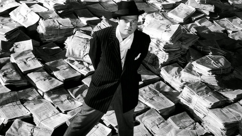
Get over it: Citizen Kane is smarter than you. It’s smarter than any and all of us—or even its own creator, for that matter.
It’s smarter, because—if as has sometimes been said—the making of any movie is a miracle, then Citizen Kane is more than a miracle. It’s the Mona Lisa of film-making: inscrutable, ineffable, and unfathomable to whomever views it.
It’s also not a bad effort for a 25-year-old first time-out-of-the-chute theatrical amateur who by his own admission in the University of Michigan Harlan Hatcher Graduate Library’s It’s Still Terrific: Citizen Kane at 75 tells us that he had no real idea of what he was doing.
Indeed, as this exhibit at the U-M Hatcher Graduate Library Audubon Room illustrates through both sight and sound, it’s very likely the film is superior because enfant terrible Orson Welles didn’t know what he was doing. Which, of course, only makes the film that much more impressive.
Review: UMMA's "Europe on Paper: The Ernst Pulgram and Frances McSparran Collection"

Europe on Paper at the University of Michigan Museum of Art certainly delivers everything it says in its title. But as is often the case at the UMMA, there’s a lot more to this exhibit than meets the eye.
For the display is a handful of seriously handsome artworks on paper. And as Lehti Mairike Keelmann, UMMA Assistant Curator of Western Art says in her introduction to the exhibit:
[T]he 47 prints, drawings, and watercolors comprising the Ernst Pulgram and Francis McSparran Collection provide a unique perspective on a momentous change in European history.The works were made between the 18th and mid-20th century,” says Keelmann, “as the continent industrialized and new modes of transportation began to crisscross the countryside, connecting growing cities. Geopolitical tensions arose as nations attempted to bolster their identities on the world stage, culminating in the violence and turmoil of the two world wars.
And as if these geopolitical upheavals weren’t dramatic enough, there was pretty good art being made all over the place, too. That’s where Pulgram and McSparran come into play. A young and adventurous couple as they had to be, they consistently evaluated and scooped up some of the finest personalized art of this explosive period through their lifetimes.
Review: "Catie Newell: Overnight" at the University of Michigan Museum of Art

I’ve always thought it was just me. That is, that my comfort with the night’s glimpse into the unknown was an element I alone enjoyed.
Little could I know that Catie Newell: Overnight at the University of Michigan Museum of Art’s Irving Stenn, Jr., Family Project Gallery would be such a vivid entry in the outsider’s world of artful darkness.
Atmospheric darkness is a rather difficult concept with which to fully come to terms. Simply said, there’s a seeming absence of something—through the presence of nothing.
Perhaps night light is the unacknowledged underbelly of the sublime - that exalted aesthetic quality distinct from manmade beauty. Which is to say, what we appreciate in nature is supposedly qualitatively different from the pleasure we receive from viewing art.
Think along the lines of standing aside Yosemite’s Half-Dome; overlooking Lake Superior at the Upper Peninsula’s Pictured Rocks Natural Lakeshore; or contemplating the dazzlingly azure beauty of Italy’s Amalfi coastline. All are indeed awe inspiring experiences.
But this yawning of nature’s infinity has always been a troublesome concept—or, at least, I’ve always thought it so. If only because there can also be no mistaking of the thrill to be found standing dead-center in the junction of New York City’s Broadway and Seventh Avenue at Times Square; or studying the overwhelming intricacy of Chartres cathedral; or, for that matter, walking the expansive panorama of St. Peter’s Square.
Yet all these glorious experiences—as magnificent as they may be—do not really hit the curious spot of simple night light. And Newell’s Overnight is as handsome an exploration of this singularity as one is bound to find.
It’s definitely been a long time coming for someone whose favorite backdrop encompasses the night’s perimeters.
An Assistant Professor of Architecture at the University of Michigan’s Taubman College of Architecture and Urban Planning, Newell joined that faculty in 2009 as their Oberdick Fellow after receiving her Masters of Architecture from Rice University and a Bachelor of Science in architecture from Georgia Tech University.
Winner of the 2011 Architectural League Prize for Young Architects and Designers; the 2011 ArtPrize Best Use of Urban Space Juried Award; and the 2011 Architectural League Prize for Young Architects and Designers, Newell has exhibited at the 2012 Architecture Venice Biennale. And after attaining the Cynthia Hazen Polsky and Leon Polsky Rome Prize Fellow in Architecture for 2013-2014, she’s now a Fellow of the American Academy in Rome.
UMMA Director Joseph Rosa and Exhibit Manager Jane Dechants say in their introduction to the exhibit, “Newell’s fascination with light is also a fascination with darkness."
“Darkness and its surrogates—ambient light; residual light; shadows, haze, and other ‘interruptions’—give the environment what she calls its double-life in daytime. A landscape may be seen and known—familiar, predictable, trustworthy—but at night it succumbs to a darkness that, in her words, removes its walls, alters its spaces, and haunts—becoming risky, even dangerous, and ultimately alien.”
This nod to darkness—and the strategic absence of darkness—is the essential element of Newell’s installation and its spectacular accompanying untitled color photography.
Newell writes in her gallery statement, the “installation is attuned specifically to the gallery’s exposure to daylight and its transformation into night. During the day, natural illumination catches reflections on the aluminum wire, and provides the best light to view the 'Nightly' [color photographic] series.
“In the evening hours after sunset and for the duration of the show, the Museum will leave its exterior lights off, allowing the installation spotlights to draw out different lines of light on the aluminum [Overnight] and create the impossible architectural moment captured in the 'Nightly' series.”
Impossible might indeed be the right word here. Because these observations indirectly infer that what one sees of Overnight is only a portion of what one does not see—at least not directly.
The installation definitely is a nocturnal treat to observe overnight. Two chevrons of multi-strand aluminum wires shimmering as they hover from the gallery’s ceiling with a single spot light shining on each aggregation, Overnight is haunting in its suspension. Tiny LED lights at the bottom of selected strands give occasional bursts of light as one passes the UMMA. There’s a decidedly ghostly ambiance to the work.

Yet perhaps it’s the photographs that are the most distinctive element of the exhibit. A series of 19 color photographs set in irregular groups of two, three, and four images around two walls of the Stenn Gallery, the 'Nightly' series is easily some of the most dramatic photography seen in Ann Arbor through this last year.
Each composition is really no more than a strategically placed spotlight that captures the mood of its surrounding landscape in an otherwise ordinary urban setting. The nocturnal iridescence of this light creates an otherworldly intimacy that dramatically dominates the photo’s milieu. As such, perhaps the most overwhelming effect of this masterly work is Newell’s keen sense of the psychological tension this imagery can have on its viewer.
If it’s a valid truism that profundity of art lies in simplicity, Newell has crafted some of the most insightful art we’re likely to see any time soon. Playing off the observation that absence can have as strong an attraction as presence, the simplicity of Newell’s Overnight installation and her 'Nightly' series is as visceral an experience as art can be.
John Carlos Cantú has written on our community's visual arts in a number of different periodicals.
University of Michigan Museum of Art: "Catie Newell: Overnight” will run through November 6, 2016. The UMMA is located at 525 S. State Street. The Museum is open Tuesday-Saturday 11 am - 5 pm; and Sunday 12–5 pm. For information, call 734-764-0395.
Overview: Pop-X 2016
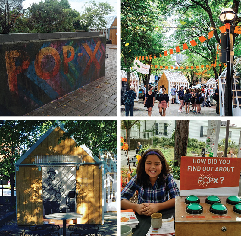
It may sound like lofty praise, but it’s becoming readily apparent that POP•X is one of the most important events on the contemporary Ann Arbor visual arts calendar. It’s a curious blend of some of our most talented arts groups and individual artists tacitly stepping out of their comfort zone.
The polish and professionalism on display in the installation site was POP•X 2016’s conventional strength—and its non-conformity was the fact that the event took place at all. While this seeming contradiction may be paradoxical to some, it follows seamlessly (perhaps even providentially) from a trajectory that fits the mood of our time.
For the fact is: POP•X fills a gap in our local visual arts that’s been all-too-lacking for some time on our arts calendar. Tucked nicely in downtown’s Liberty Plaza, the installation site was as tidy and manageable as an arts event could be in contrast to the overwhelming behemoth that annually invades Ann Arbor over the course of a week in July. That massive congregation may be ostensibly devoted to the arts, but it’s not really about art. Rather it’s a merchandizing juggernaut that allows the entire community to celebrate the idea of art.
By contrast, POP•X 2016 is a different thing altogether. It partakes of the slightly off-kilter vibe of the mid-20th century “happening.” Granted, it’s far tamer than the Allan Kaprow inspired performance art which sought to perplex as much as it meant to elucidate. But then again, everything slows down as it matures.
There’s instead a touch of the provocateur in POP•X 2016. And the art is of sufficient quality as to gently mask this tension. Instead, as would have been noted by the countercultural Fluxus group of this same mid-20th century period, it’s the sheer concreteness of POP•X that democratizes the activity. There’s no artificial boundary to the event (outside of its physical boundary) because the only border to POP•X 2016 is territorial and this is a logistical distinction.
Whether referencing Kaprow’s performance art or Fluxus’ abstraction, it was one of Neo-Dada's conceits that art be taken off the wall—Pop Art, Environmental Art, Conceptual Art, Optical Art, and other likeminded art forms of this stripe—sought to reinterpret the concept of art altogether. Yet one of the aesthetic ironies of Modernism was that even these kinds of art were still typically found confined to the gallery setting with all the expectations of such pretensions.
Let’s just suffice to say POP•X 2016 bursts though the aesthetic fourth wall of the gallery mentality by gleefully setting up shop outdoors and letting the setting itself serve its basis. But the conventionality of the “art” market has also restricted the possibilities of democratizing the aesthetic potential.
By contrast, POP•X effectively uses the conventions of art to work in an allied configuration that expands these possibilities. Indeed, it’s likely (on the presumption that Ann Arbor is wise enough to continue in this vein) that the possibilities of POP•X have not really yet been broached.
If only for the reasons mentioned above: There’s a homey feel to the POP•X 2016 spirit that’s channeled through the professionalism of the artists and art groups on display. The impulse is clearly there: For example, Lisa Waud’s incarnation of her Detroit-based Flower House utilized her installation to craft a display of nature that threatened to burst from its confine. And although it was based on the limitation of its video monitors, there is a remarkable amount of possible expansion in Donald Harrison and Martin Thoburn’s invigorating four-channel installation roaming Ann Arbor from each direction via its Liberty Plaza starting point.
Effectively—and, again, presuming our arts community is wise enough to build on this remarkably dexterous POP•X format—we still haven’t seen what POP•X 2016 can really be. The possibilities are there; just as the evolution of the village lies in the flexibility of the pavilion format. And this is the most exciting—as well as most important—element of the format.
As is evident from other places and events, contemporary art is clearly reconsidering itself at this time through the adventurousness of its practitioners. It was most evident in the mid-to-late 20th century through the reincarnation of ceramics, fabrics, and functional design.
This is the fundamental and continual challenge of all aesthetics. And POP•X is on the vanguard of this most recent artful transition. So the only real question then is what this change can be?
Because if POP•X 2106 is any indication, we don’t really know yet. For it’ll be the task of our local artists and arts groups as well as visionaries like the Ann Arbor Art Center’s Omari Rush to nurture the concept through its possible growth.
Rather than hope that we see a POP•X again—think in terms of how we see it again. For this is the test of the visual arts.
John Carlos Cantú has written on our community's visual arts in a number of different periodicals.
POP•X is an annual ten-day festival presented by the Ann Arbor Art Center. POP•X 2016 was Thursday, September 22 through Saturday October 1, 2016 from noon to 8pm at Liberty Plaza Park, 255 East Liberty St, Ann Arbor. To learn more visit popxannarbor.com or the POP•X Facebook event page. POP•X is free and open to the public.
Review: Re: Formation at the Ann Arbor Art Center

The Ann Arbor Art Center’s latest exhibit is the Re: Formation to help begin all reformations.
As the exhibit’s statement tells us, the display “examines this unique moment [in history] when ordinary people are declaring a la Peter Finch [from Sidney Lumet’s 1977 film Network]: “‘I’m mad as hell and I won’t take it anymore.’”
This is indeed the precise sentiment of this unceasingly clever exhibit of art.
For Re: Formation, the latest offering of Rocco DePietro and Gloria Pritschet, founders and directors of the Gallery Project, follows suit with this artful duo’s willingness to go where most other forums fear to tread. Ann Arbor's Art Center exhibit pairs with an earlier August incarnation of the show exhibited through the auspices of Toledo, OH’s Art Commission.
As the exhibit statement continues, “What is different at this time is that people who have been silent, or silenced, are standing up, speaking out, and mobilizing for needed change. Highly divergent in life styles with broad-ranging backgrounds, beliefs, and values, these individuals are expressing justifiable anger at the accumulation of horrific events and unrelenting injustices that characterize our current era.
“They are teaming up across race, gender, politics, and social status with empathy and compassion for their fellow human beings. Their actions are reestablishing belief in a positive future based on fairness, equity, and genuine possibility for all.
“Is this a tipping point, a moment for reform, or even a revolution? Or is it just another blip before capitulation and regression?”
These are, of course, highly potent questions. The very nature of this articulation will be considered by some as transgressive. But the paradox, of course, is that the very nature of the contention leaves motivation and avocation hanging equally in the balance.
Because of course, the definition of art itself is being challenged in Re: Formation. What is the purpose of art? Is it meant to merely have a decorative function? Or is it meant to provoke and challenge one’s preconceptions?
The Gallery Project is letting us know what they think, and towards this end DePietro and Pritschet have mobilized a formidable array of national, regional, and local talent whose outlooks cut across a whole host of social, political, and cultural viewpoints. There are (to borrow from a questionable cliché) no sacred cows here. And even if there were, it would be just as many of the artists on display who would want to devour it as there are others who would hold it sacred.
Local talents on display are Ann Arbor’s Heather Accurso, Morgan Barrie, Carolyn Barritt, Ruth Crowe , K.A. Letts, Melanie Manos, Michael Nagara, Sharon Que, Jesse Richard, Meagan Shein, Ellen Wilt and Richard Wilt. Dexter is represented by Tohru Kanayama; with participation by Ypsilanti’s Nick Azzaro and Jessica Tenbusch.
Among the works on display, Azzaro gives us a potent taste of Re: Formation’s disposition. His unframed “Progress at the Ol’ Smith Furniture Building” color photograph touches on all the ideas stated in the exhibition’s gallery statement.
There are, of course, Americans who to this day think of the Confederate States of America’s second Battle Flag as a sacred totem of historic significance with as much a symbolic value as the United States’ stars and stripes. Indeed, these stars and bars—in either its peace or war confederate configuration—are still part of the symbol (and considered a venerated heritage) in parts of the American south and officially designated in three southern states.
But the flag is also a highly potent symbol of a heritage that is itself emblematic of one of the most controversial aspects of our republic’s heritage. Representative of the defense of slavery as a political institution, the Dixie Battle Flag serves as a visceral reminder of attitudes that cut across economic, social, and cultural lines. As such it’s not uncommon to find the flag on private property such as flag pole or car—now often in a setting that is seemingly as much defiance as it is supportive.
Thus Azzaro’s photograph transgresses these values by vividly appropriating the symbol and subverting its erstwhile significance. Running across a dilapidated storefront with this flag in flames, “Progress at the Ol’ Smith Furniture Building” is a straightforward, aggressive recasting of social, economic, political, and cultural American expectations.
Just like many other artworks on display in this highly emotionally charged exhibit, if Azzaro’s “Progress at the Ol’ Smith Furniture Building” isn’t a Re: Formation of American expectations, it’s hard to imagine what might be.
John Carlos Cantú has written on our community's visual arts in a number of different periodicals.
Re:Formation will run through October 8, 2016, at the Ann Arbor Art Center, 117 W. Liberty St. Exhibit hours are 10 am to 7 pm, Monday-Friday; 10 am to 6 pm, Saturday; and noon to 5 pm, Sunday. For information, call (734) 994-8004.
Review: "Manuel Álvarez Bravo: Mexico’s Poet of Light," University of Michigan Museum of Art

The University of Michigan Museum of Art’s Manuel Álvarez Bravo: Mexico’s Poet of Light is easily going to be one of the most accurate art exhibition titles of 2016. This tidy 23-piece UMMA display shows the world-famed Bravo at his best: For he’s indeed a master of photographic light—as well as a poetic artist.
All photographers are capable of what is sometimes called a “privileged moment.” After all, it would seem simple enough to capture a moment with photography: You just point your camera and click.That's what's been happening photographically for quite nearly this last 150 years ... right?
Well, not quite. After all, you have to know what you're looking for because the most remarkable thing about photography is the camera’s utterly elastic way of recording an image. The world isn't as transparent as might seem apparent on first observation. And it doesn’t take much more than one’s last batch of photos for the confirmation.
Bravo, on the other hand, knew what he wanted to see—but the craft didn’t stop there. For the next rule consists of mechanistically knowing how to get what you want to see. And this is as complicated a task as knowing what one’s looking for.
It’s at this point that poetry arises—and was Bravo ever a masterful poet.
He’s easily one of the greatest photographers of the 20th century. For this poetry is, of course, the magic of all the world's greatest photographers. Like a mechanistic fingerprint, no two photographic styles are ever really the same. Time, space, intuition, and the very act of looking all mark the poetry latent in the photographic medium.
One glance at Manuel Álvarez Bravo: Mexico’s Poet of Light and it's obvious Bravo knew what he was looking for. Each Bravo artwork in this magnificent exhibit is an extraordinarily well thought-out composition where every visual element is accounted for; these physical elements being weighted against the tone of light, the density of light, the direction of light, the volume of light—and then there’s the poetry.
What’s left in the image is the world unto itself.
Granted, the time in which Bravo was working is romantic. Mid-20th century Mexico was a world where the natural and the supernatural seemingly melded together in a heady exotic brew and where the sacred and the profane coexist comfortably. There’s seemingly no separation between what is well and what is well-enough.
Born into an artistic Mexican family, Bravo was forced to terminate his education at the age of 12 when his father died in 1914. Studying accounting as he worked for the Mexican Treasury Department, Bravo freelanced photojournalism while learning the basics of art photography. It was through the friendship of fashion model and political activist Tina Modotti that he made contact with American photographer Edward Weston who in turn encouraged him to polish his craft.
Having lived through the Mexican Revolution of 1910-1920, Bravo was inclined to view his art through the prism of natural supernatural romanticism (and later surrealism) that marks early 20th-century Mexican aesthetics. As can be seen in the photographs of this exhibit, Bravo wrestled with the stereotypes that stamp much Mexican artistry while often using echoes of this stylization to comment upon them. Bravo's camera consistently catches these contradictions with a fluid grace that never editorializes while knowingly commenting on what’s depicted.
This means that every element of Bravo's photography is weighted against the composition's visibility as well as the reflection of Mexican culture as he lived and understood it. The result is indeed sheer poetry cum anthropology, as none of these photographs are never quite what they appear.
For example, Bravo’s 1977 gelatin silver print Señor de Papantla (“The Man of Papantla”) is a decidedly clever photograph whose background and meaning are richer than apparent in the already rich photograph of a Mexican campesino dressed in his best peasant garb. For the locale of the painting is as important as the image in that Papantla (in the state of Vera Cruz; in the Sierra Papanteca range, near the Gulf of Mexico) is famed as one of Mexico’s “pueblo mágico”—a city of particular natural beauty with historic and cultural relevance.

Bravo’s Señor stands stiffly with his sombrero tucked under his right arm posed in front of a nondescript stone wall. Standing under the diagonal right shade of a tree with his hair parted in the same direction to create an internal symmetry, of equal importance is his eyes cast away to the left in the same way. Averting the photographer’s gaze, Bravo’s Señor reflects the subdued unwillingness to cooperate that’s often characterized the citizenry of a country that’s seen centuries of repetitive political, social, and cultural upheaval.
By contrast, famed Mexican artist Frida Kahlo adopts an opposite stance for Bravo’s camera in her 1938 Frida with Globe, Coyoacan, Mexico gelatin silver print. Where the campesino was not directly addressing the camera, Kahlo challenges the camera by looking directly at Bravo. This act, of course, is in direct contrast to the Mexican sense of social propriety where the expectation would decidedly be a repressed feminine averral.
Even in the late 1930s, Kahlo (and by extension, Bravo) were having none of this modesty. Sheer appropriateness is drawn from her forthright respectability, as though the appropriateness of one’s behavior is as much one of correctness as it is self-respect. Seated with her left elbow propping her left hand against her cheek, Kahlo is everything she intends to be.
But Bravo is also addressing his audience in that a single subtle compositional element twitches the history of art anachronistically. For in contrast to Diego Velázquez’s 1656 painting Las Meninas (where Velázquez paints himself painting the painting), Bravo eliminates himself from his photograph because there is no photographer reflected in the globe on the table next to Kahlo’s left. Surrealism was, of course, in full force in Europe at this time and Bravo opts to magically disappear in his own artwork.
If, however, one wants to find Bravo at the height of his power as a photographer, his famed 1932 gelatin silver print Retrato de lo eterno (“Woman Combing her Hair”) seals the deal. The exact translation of the title is “Portrait of the Eternal” and while the more prosaic “Woman Combing her Hair” is certainly accurate, the fantastic inference of “Portrait of the Eternal” is more enduring.

As I noted in the September 2002 UMMA Manuel Álvarez Bravo: 100 Years exhibition, Retrato de lo eterno captures Bravo at his haunting best. This darkly handsome portrait—of yes, a woman combing her hair—is everything its title says. Yet it’s also far more, as Bravo’s key lighting in this black and white photograph boldly exposes the model’s profile while also draping her in a controlled chiaroscuro where graded shadows create layer upon layer of profound mystery. The model’s self-absorbed beauty is veiled in an eternal mist.
Bravo’s Retrato de lo eterno is as much a staggering a work of genius today as it was in 2002. Just consider us lucky to look upon her likeness once again after fifteen years. If only because she’s indeed a portrait of the eternal—and this portrait will be so for a long time to come.
John Carlos Cantú has written on our community's visual arts in a number of different periodicals.
University of Michigan Museum of Art: “Manuel Álvarez Bravo: Mexico’s Poet of Light” will run through October 23, 2016. The UMMA is located at 525 S. State Street. The Museum is open Tuesday-Saturday 11 am–5 pm, and Sunday 12–5 pm. For information, call 734-764.0395.
Review: "Catherine Opie: 700 Nimes Road," University of Michigan Museum of Art
The University of Michigan Museum of Art’s Catherine Opie: 700 Nimes Road is a star-studded two-for-one visual art spectacular. 50 photographs culled from over 3,000 taken in 2010-11 by Los Angeles-based photographer Catherine Opie at the residence of actress Elizabeth Taylor, the exhibit illustrates the six months this famed contemporary photographer spent taking photos at Taylor’s Bel Air residence through the coincidental period of Taylor’s death.
Drawn from two Opie photographic series—Closets and Jewels and 700 Nimes Road—where Opie had unlimited access to Taylor’s home, the display is organized by L.A.’s Museum of Contemporary Art with lead support provided by J.P. Morgan Private Bank; philanthropists Jamie McCourt and Gilena Simons, with UMMA support provided by the U-M Health System; Bank of America; Merrill Lynch; philanthropists Alan Hergott and Curt Shepard, with additional support provided by the U-M Departments of the History of Art; Screen Arts and Cultures; and American Culture.
As we all well know, Elizabeth Taylor had a way of galvanizing attention. And the range of these supporting groups indicates how galvanizing she rightly could be. For Catherine Opie: 700 Nimes Road is as fascinating a keyhole as we could imagine of this world-famous woman’s life.
Opie herself is quite the celebrity. An award-winning photographer (and professor of photography at the University of California at Los Angeles) who works in the intersection of portraiture, landscape, and studio photography, Opie specializes in crafting transgressive imagery that knowingly blurs the intersection of private and public spaces. Mingling her expertise in a variety of photographic and printing technologies with social and political commentary, Opie has consistently produced photographs that document the shadows of our society.
By contrast, these 700 Nimes Road photographs are about as above the photojournalistic fold as Opie’s art gets. Inspired by southern photographer William Egglston’s 1984 photographs of Elvis Presley’s Graceland mansion, she and Taylor shared business manager Derrick Lee, and after negotiating with Taylor’s longtime executive assistant Tim Mendelson, Opie was given full access to 700 Nimes Road. She was busily peering in and around the corners of Taylor’s residence when the actress died of congestive heart failure on March 23, 2011
It’s this dramatic turn of events that makes 700 Nimes Road a masterful display of unceasingly studied and provocative photography. For it’s indeed a perfect melding of professional fine arts photography and screen diva as Opie never actually met Taylor in person through the course of her photographic work.
Thus what’s most fascinating about this non-meeting is the Elizabeth Taylor that Opie illustrates—and not the Elizabeth Taylor she might have met. After all, by the time of this assignment, Taylor had gone through umpteenth career cycles as a screen star ranging from guileless ingénue to international screen icon to television guest star. For Taylor shined bright at each turn of her lengthy career: Winner of two Academy Awards for Butterfield 8 (1960) and Who’s Afraid of Virginia Woolf? (1966), Taylor closed her acting career with a minor role in 1994’s The Flintstones for which she was nominated as Worst Supporting Actress by the Golden Raspberry Awards.
Yet this was also hardly the extent of Taylor’s lifework. She was an astoundingly successful businesswoman who launched her own best-selling fragrances Passion in 1987 and White Diamonds in 1991 that led to an estimated $600 million to one billion dollar personal wealth. After her death, her estate was dispersed by Christie’s auction house for a then record-breaking $156.8 million dollars with an additional $5.5 million dollars for her clothing and accessories. And her final career turn was an equally winning philanthropist for HIV/AID activism culminating with a Presidential Citizens Medal in 2001.
That’s a lot acclaim for one lifetime. So perhaps the most remarkable aspect of Opie’s art photography is her uncanny condensation of each of these many Elizabeth Taylors with visual references to her many loves—seven husbands; with countless friendships—through the sheer effect of being Elizabeth Taylor.
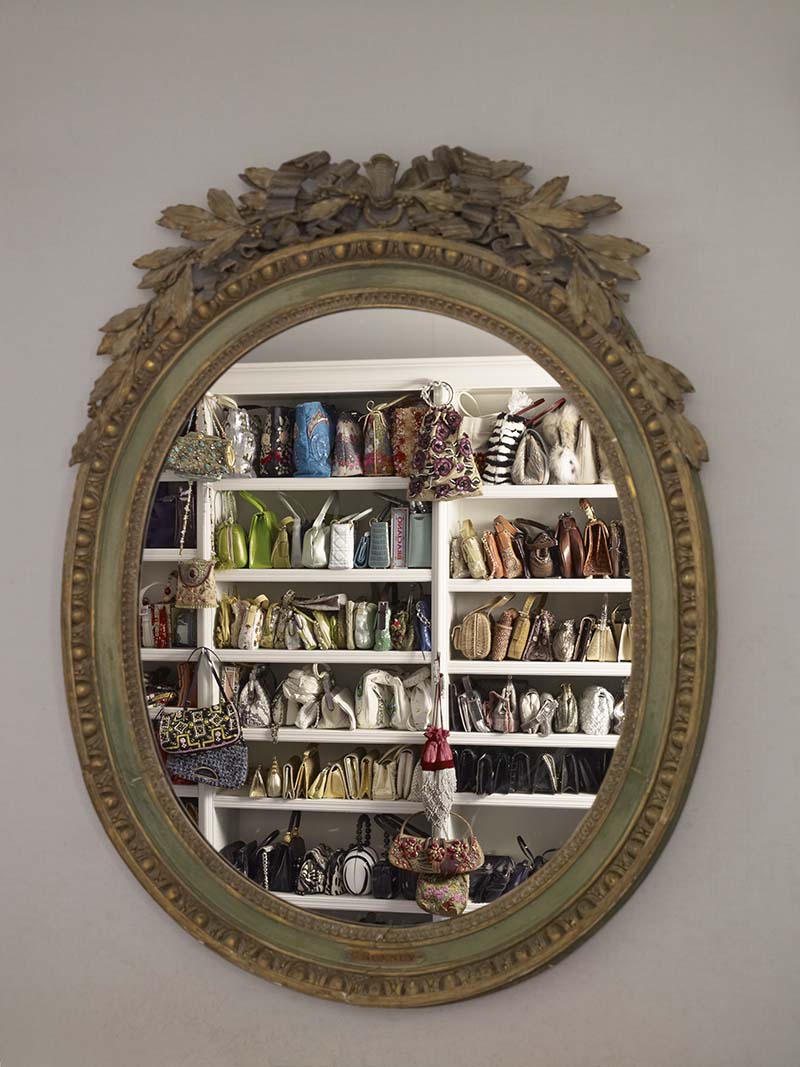
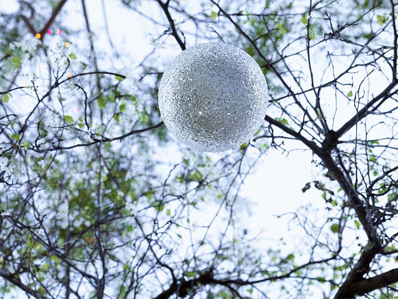
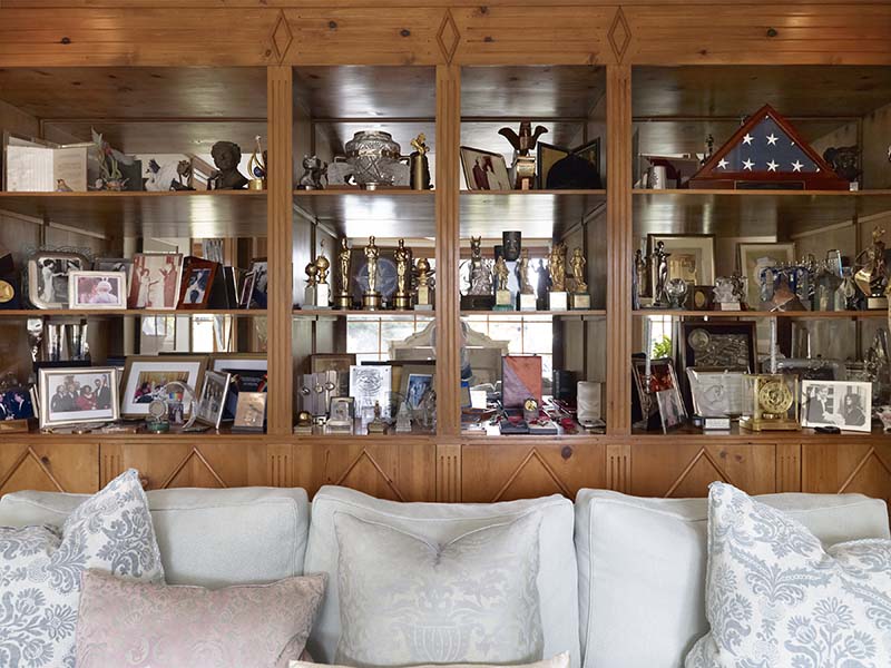
We certainly learn more about what it meant to be Elizabeth Taylor through Opie’s photos than through the proverbial thousand words. In some photos, Taylor’s pets make their appearance rummaging about her personal items. Other photographs feature personal Taylor keepsakes (including one photo of the box holding ex-husband Richard Burton’s 1972 gift of the famed Taj Mahal diamond necklace on her 40th birthday), with other photos featuring her raft of celebrity friends in informal guise. Yet other photographs give us extraordinary visual details of Taylor’s personal routine ranging from a massive number of orderly stashed handbags in one closet to an astounding number of awards in her “trophy room” to a single holiday ornament floating in midair.
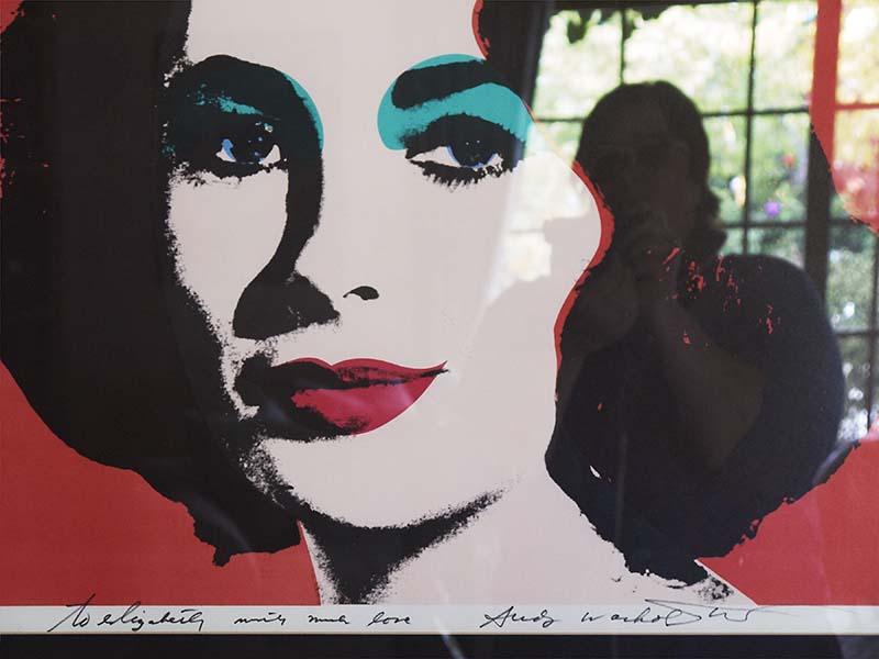
Still, fine art will stand out in fine art photography exhibits. And a single signature Opie photograph of Taylor in the abstract as reflected through the visage of her celebrity makes 2010-11’s Elizabeth (Self-Portrait, Artist) archival pigment print a first among equals in this intriguing exhibit.
The bouncing signifiers in this photograph alone make it a superior artwork. For the photo features Opie photographing herself off a bounced image of Andy Warhol’s famed 1966 silkscreen Liz #6 [Early Colored Liz].
In a career unceasingly devoted to celebrity, Warhol’s Liz #6 [Early Colored Liz] is one of his most recognizable portraits. The silkscreen features a desaturated Taylor with a sharp near-monochromatic contrast with the exception of eggshell blue eye shadow and an equally strategic contrast between his framing red background and the actress’ signature brushy bouffant brunette hair. Inferring her beauty as much as painting it, Warhol creates an idealized, romanticized image of Elizabeth Taylor that represents her public image at the height of her glory.
Opie, on the other hand, is the blurred background image to the side of Taylor in Elizabeth (Self-Portrait, Artist). Crafting a superior art photo that bounces herself sideways off the print’s framing glass, Opie links Warhol, herself, and her subject’s idealized portrait in a single image that celebrates Taylor mystique as well as her own personal property autographed by Warhol with the phrase “with much love.”
In a single masterly image, Opie shows us how this actress held—and continues to hold—such strong affect on our emotions to this day. Opie’s Elizabeth (Self-Portrait, Artist) self-reflexively recalls Liz #6 [Early Colored Liz] today with as much love as Taylor was able to engender then.
John Carlos Cantú has written on our community's visual arts in a number of different periodicals.
University of Michigan Museum of Art: “Catherine Opie: 700 Nimes Road” will run through September 11, 2016. The UMMA is located at 525 S. State Street. The Museum is open Tuesday-Saturday 11 a.m.–5 p.m.; and Sunday 12–5 p.m. For information, call 734-764.0395.
Review: "Real American" at the Ann Arbor Art Center

The Ann Arbor Art Center’s latest 117 Gallery offering asks a tantalizing, if not also impossible question to satisfactorily answer: Who—and what—is a real American?
Indeed, more precisely: What physical, cultural, theological, and/or social features does a real American have? Do these perimeters have any boundaries that pertain to being a “real” American? And what are the political consequences—if there are any such consequences—attached to this definition?
After all, the presumption is (and it’s certainly been repeated enough during this present election cycle) that there is such a thing as a “real” American. And it’s a seemingly strong potion upon which to mount a political campaign.
But is there such a thing as a real American? This display of superlative art intends to find out—for better or worse.
As juror and Ann Arbor-based photojournalist Peter Baker tells us of his rationale for the exhibit, “Real American” seeks to “explore the generational, ethnographic, cultural, and anthropological ideals of what the word ‘American’ means. From fresh apple pie to Budweiser, the Star Spangled Banner to Party in the USA, what is the modern American experience?
“Are we entering the sci-fi World of Tomorrow, longing for the Norman Rockwell past, or painting ourselves into an Idiocracy? If our culture is our biggest export, what kind of image are we presenting to the world?
“This exhibition,” concludes Baker “seeks artworks that span the spectrum from whimsical to austere, nostalgic to provocative. Artworks may consist of images from popular and visual culture, contain everyday objects assembled in unexpected ways, or incorporate stars and stripes.”
Correctly said—and perhaps the best thing about Baker’s selections in this show is the extraordinary range of what a real American can be. After all, even if the common understanding is also obviously a caricature, Americans cannot by definition or description be said to be analogous to what a Frenchman or Irishman or Nigerian supposedly looks like—or supposedly is. The beauty of the term is that a real American can look like all stereotypes.
Local, regional, and national artists selected for inclusion by Baker are Jim Aho, Mark Bleshenski, Tina Blondell, CJ Breil, Sarah Buddendeck, Seder Burns, Barbara Melnik Carson, Vanessa Compton, Errol Daniels, Keith Downie, Dan Farnum, Kathie Foley-Meyer, Heather Freeman, Jonathan Frey, David Gardner, Sarah Hahn, Amber Harrison, Christian Helser, Timothy Householder, Melissa Lynn, Astrid Muller-Karger, Dietmar Krumrey, C.B. Murphy, John Posa, Shawn Quinlan, Jim Rehlin, Jaye Schlesinger, Geoffrey Stein, Marilynn Thomas, Seth Trent, Tamara Wasserman, Chad Yenney, and Micah Zavacky.
Baker’s Best of Show selection in the exhibition is Pittsburgh, PA resident Shawn Quinlan’s quilt and fiber “The New American Heritage.” Second Place is Tulsa, OK photographer Dan Farnum’s archival inkjet color photograph “Monster Energy, Tulsa.” Third Place is Ann Arbor John Posa’s untitled acrylic on canvas mixed-media deer hide and scrap metal Donald Trump portrait. And Honorable Mentions have been handed to Minneapolis, MN’s Tina Blondell for her oil on canvas “Antimony as Nubia” and Denver, CO’s Melissa Lynn for her “Mitchelen BigMan—Crow Indian/Iraq Veteran” chromogenic color photograph print.
As stated above—and is the case with most group exhibits—there’s no particular rhyme nor reason to the artwork in “Real American” outside of taking general aim at the topic. And interestingly enough, this speaks of both the pluralism of our society as it does these artists’ decidedly independent frame of mind. The exhibit proves it’s a good American place to be.
For example, Shawn Quinlan’s Best of Show quilt and fiber “The New American Heritage” is an emphatic satirical take on what is real about being a “Real American” as the quilt takes scatological aim at the U.S.A. through its lampooning of our society’s strengths and weaknesses. Uncle Sam is depicted as a red, white, and blue clown with straw hat atop and arms propped with disembodied six-shooters at waist-height standing in front of a cloud of newspaper smoke and fire. Add an exceptionally buff George Washington as well as a vaguely surreal exquisite corpse Abraham Lincoln charbroiling a steak and Quinlan’s “The New American Heritage” is a rather pungent view of what it means to be a “Real American.”
“The New American Heritage” is one of many artworks in this exhibit that have an overt political or social bent—this is the kind of display that brings out the best of this kind of parody. Yet license of free thought is only one aspect of what it means to be an American. On the other hand, Baker’s Second Place archival inkjet “Monster Energy, Tulsa” by Dan Farnum touches far more subtly and thoughtfully at class and economics in its artless depiction of an everyday group of archetypical American youths standing casually in front of suburban strip mall.
But so much for politics: The exhibit is also exceedingly lyrical, and my favorite work on display is Allen Park, MI Seder Burns’ magnificent archival inkjet “RV Camped for the Night on BLM Land in Colorado” color photograph that describes an “unexpected, quirky, and complex” view of what it means to be a real American.
This lone camper vehicle, taking advantage of federal regulation that allows for extended free camping (albeit in a band of states running vertically from Montana to New Mexico; horizontally west to the Pacific Ocean) is shown after dusk set against a magnificent American countryside with stars and stripes strategically draped across the front windshield.
Burns’ photograph clearly partakes of what it means to be a “real” American as there’s a free-spiritedness that’s been part of our national wanderlust reaching back for centuries from the days of Native American habitation up and down North America to varied European-based explorations through the Manifest Destiny that’s subsequently championed continental expansion. His “RV Camped for the Night” merely gives this notion a well-deserved 21st century spin.
Shawn Quinlan, Dan Farnum, and Seder Burns ultimately span the range of what Baker heartily illustrates in this exhibit. Yet there are, of course, many more views. What’s implicitly inferred in each work in this display is the belief that what it means to be a “real” American is really no more than a psychological state of mind—and everything else proceeds from there.
John Carlos Cantú has written on our community's visual arts in a number of different periodicals.
“Real American” will continue through August 13 at the Ann Arbor Art Center 117 Gallery, 117 W. Liberty St. Exhibit hours are 10 am to 7 pm, Monday-Friday; 10 am to 6 pm, Saturday; and noon to 5 pm, Sunday. For information, call (734) 994-8004.
ARTS AROUND ANN ARBOR
MAKE IT A REGULAR PART OF YOUR WEEK


